
We are excited to release the new features: iOS 15 and iPadOS 15, New devices, Improvements for CPU and Memory usage, Settings: max number of devices, Support for New technologies, Latest Security fixes.
Important: learn more about new workflow in our new Getting Started Guide.
Our response to Russian aggression
We hereby publicly condemn Russia’s aggression against Ukraine and its people. Blisk team supports the Armed Forces of Ukraine to resist Russian aggression, occupation, and war crimes. We strongly urge everyone to support Ukraine as well. The National Bank of Ukraine has opened a special fundraising account to support the Armed Forces of Ukraine and people affected by Russia's aggression. Your help and reposting on social networks are appreciated. Together we stand!
Слава Україні! Героям Слава!
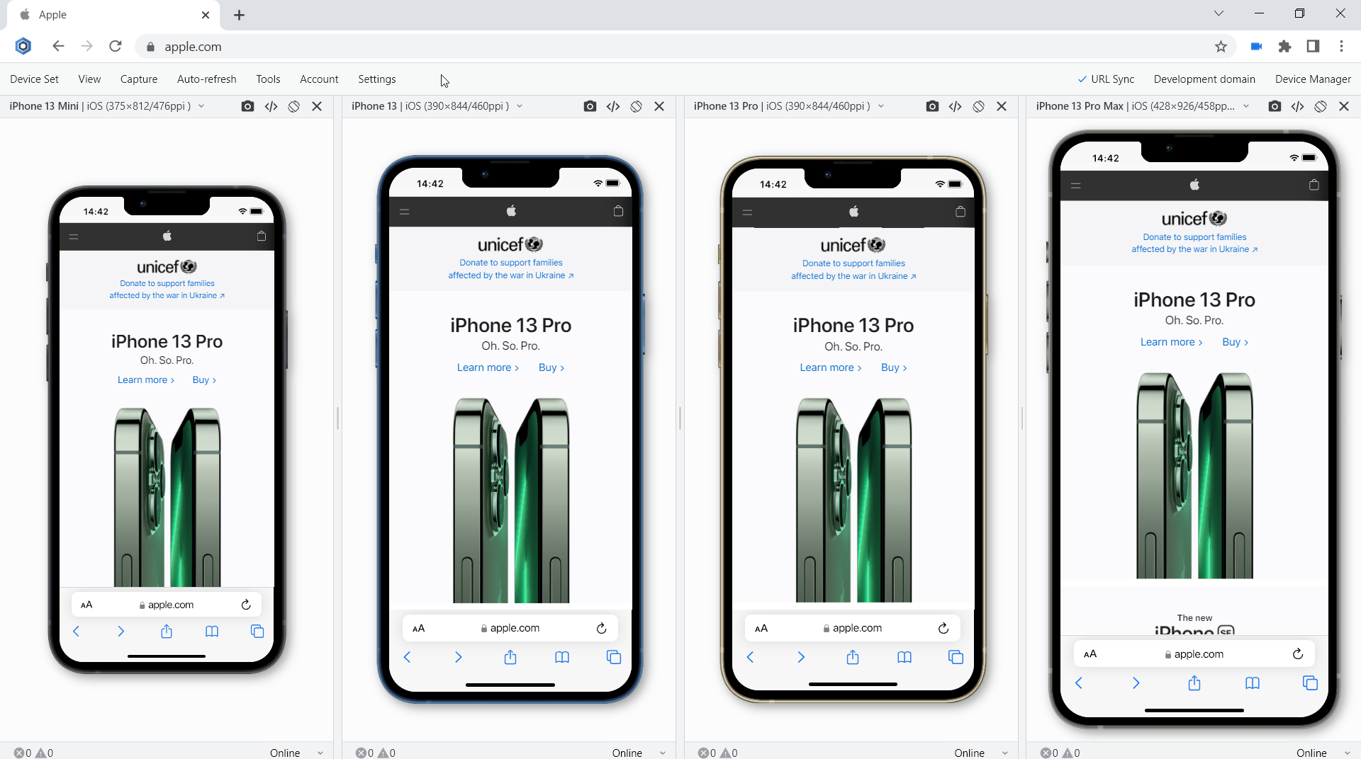
iOS 15 for iPhones and iPadOS 15 for iPads
Since version 18.0, Blisk supports iOS 15 and iPadOS 15 to perform any kind of mobile-friendly test on the latest iPhones and iPads:
- Test mobile and desktop ›
- Mobile test for touch events ›
- Mobile test for single-page apps ›
- Mobile test on slow connection ›
- Mobile test on real size ›
- Mobile test in portrait and landscape ›
- Mobile test in dark mode ›
- Mobile test for webpage errors ›
- Testing Emails on mobile ›
Requirements: this feature is available in Blisk v.18.0.194.12 and later. You may need to update the Blisk application to use this feature. View Documentation.
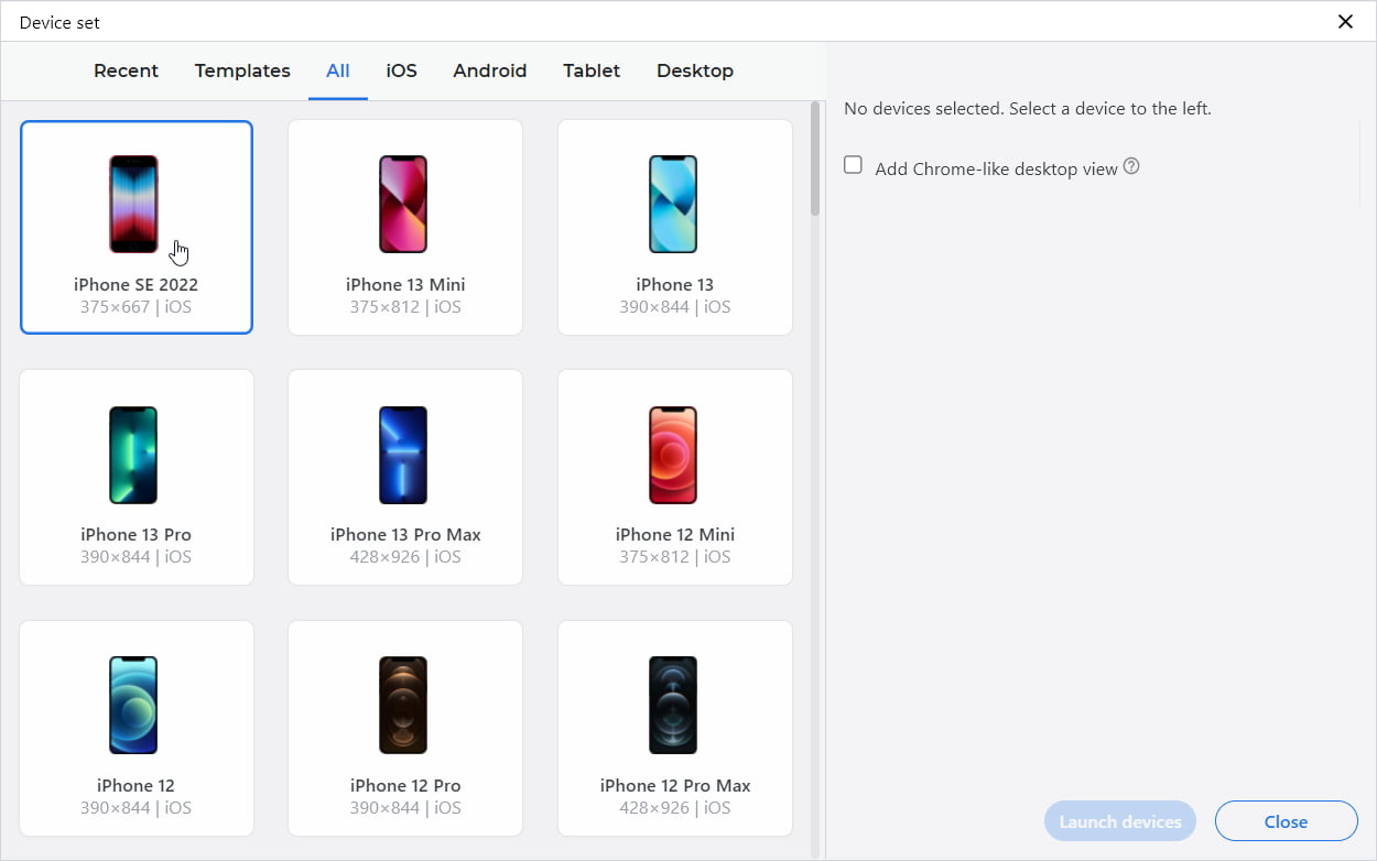
New device: iPhone SE 2022
The latest iPhone SE 2022 released by Apple recently is now available in Blisk. The device specification with viewport, screen size, device pixel ratio, CSS media query is available in iPhone SE 2022 overview. The specs of other devices are located in our Device center.
Improvements for CPU and Memory usage
Blisk v.18 features improvements for CPU and Memory usage. The reworked Developer mode was optimized to reduce the calls for the application resources and save CPU and RAM. As a result, each tab uses less resources and has improved user experience - we managed to prevent flashing of tab contents for the device sets with up to 6-8 devices (the number depends on your device OS and CPU).
Settings: max number of devices
One of the features that are often requested by users is increasing the number of devices in a device set. This feature has a high demand for the users that are performing device tests on multi-monitor systems or large TVs. By default, Blisk limits device set to have 8 devices to prevent high load on the CPU. Since version 18, you can change the limit of devices in Developer Mode Settings.
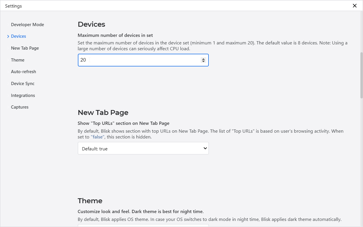
Important: using a large number of devices can seriously affect CPU load.
New technologies support in Blisk
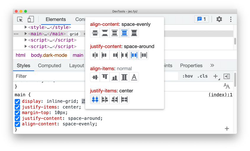
DevTools: CSS Grid editor
When an HTML element on your page has display: grid or display: inline-grid applied to it, you can see an icon appear next to it in the Styles pane. Click the icon to toggle the CSS grid editor. Here you can preview the potential changes with the on-screen icons (e.g. justify-content: space-around) and author the grid appearance with just one click.
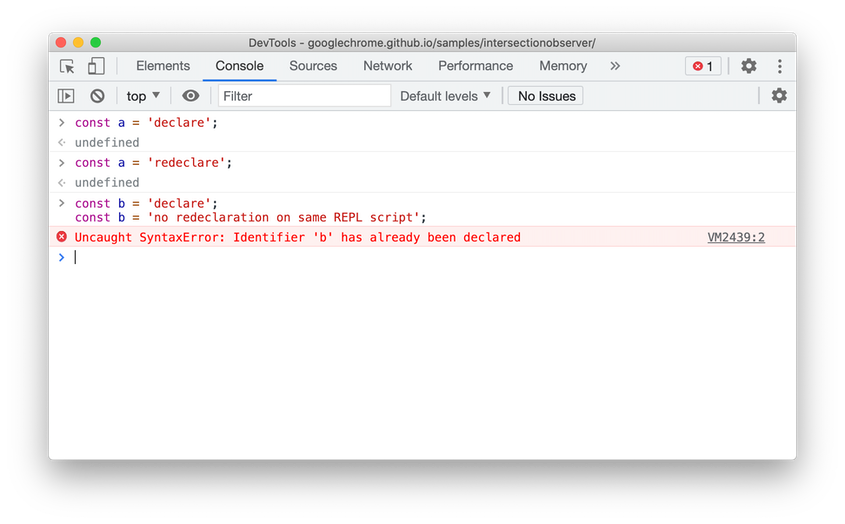
DevTools: Support for const redeclarations in the Console
The Console now supports redeclaration of const statement, in addition to the existing let and class redeclarations. The inability to redeclare was a common annoyance for web developers who use the Console to experiment with new JavaScript code.
This allows developers to copy-paste code into the DevTools console to see how it works or experiment, make small changes to the code and repeat the process without refreshing the page. Previously, DevTools threw a syntax error if the code redeclared a const binding.
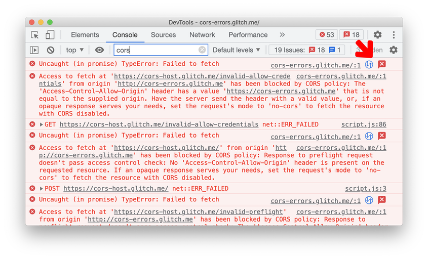
DevTools: Improved CORS debugging
CORS-related TypeErrors in the Console are now linked to the Network panel and Issues tab. Click on the two new icons next to the CORS-related error message to view the network request, or understand the error message further and get potential solutions in the Issues tab.
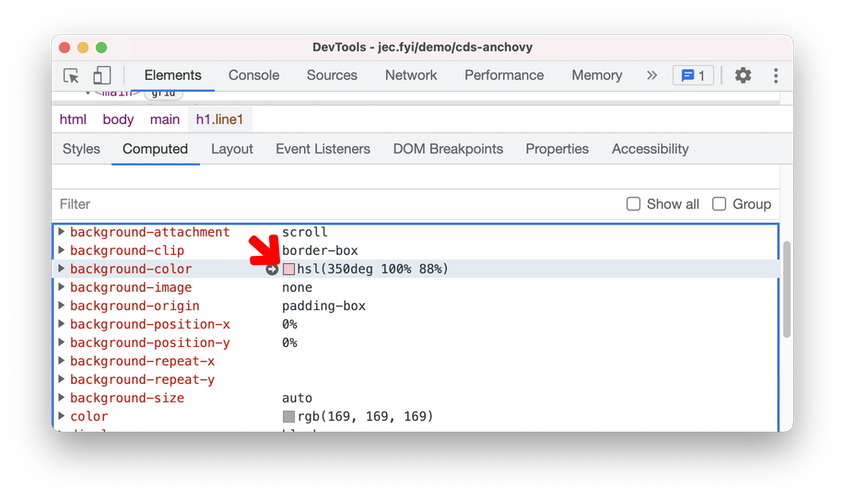
DevTools: Change color format in the Computed pane
You can now change the color format of any element in the Computed pane by Shift + click on the color preview.
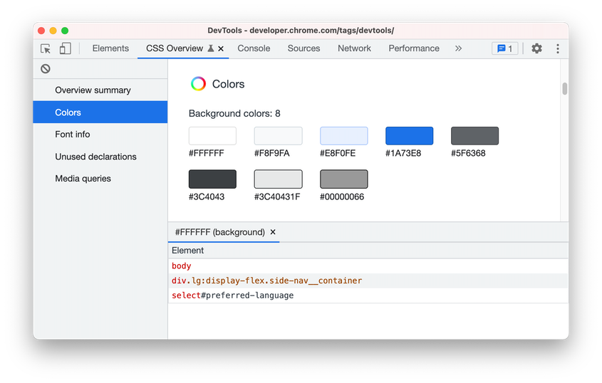
DevTools Preview feature: New CSS Overview panel
Use the new CSS Overview panel to identify potential CSS improvements on your page. Open the CSS Overview panel, then click on Capture overview to generate a report of your page’s CSS.
You can further drill down on the information. For example, click on a color in the Colors section to view the list of elements that apply the same color. Click on an element to open the element in the Elements panel.
DevTools: New CSS length authoring tools
DevTools added an easier yet flexible way to update lengths in CSS! In the Styles pane, look for any CSS property with length (e.g. height, padding). Hover over the unit type, and notice the unit type is underlined. Click on it to select a unit type from the dropdown.
Hover over the unit value, and your mouse pointer is changed to a horizontal cursor. Drag horizontally to increase or decrease the value. To adjust the value by 10, hold the Shift key when dragging.
Relative indexing method for Array, String, and TypedArrays
Relative indexing via negative indices is a feature that enjoys popularity in other languages (e.g. Python) as well as having been requested by JS programmers.
As a result, the new method was implemented, named at(), to Array.prototype, String.prototype, and the TypedArray prototypes, that permit relative indexing with negative indices.
let arr = [1,2,3,4];
arr.at(-1); // Returns 4
crypto.randomUUID()
Generating random UUIDs is a common need for web applications (the uuid module on npm is installed > 200,000,000 times a month). Developers who have not been exposed to RFC 4122 might naturally opt to invent their own approaches to UUID generation, potentially using insufficient PRNG implementations. Standardizing a UUID method, which dictates that a CSPRNG must be used, helps protect developers from security pitfalls.
Details: The method crypto.randomUUID() is used for generating RFC 4122 version 4 identifiers. The method returns the namespace specific string representation (for example, "6e4decd0-6066-4a25-98e3-0227317cda52").
Size-adjust descriptor for @font-face
The size-adjust descriptor in @font-face allows scaling of glyph sizes for a particular font face without affecting the CSS font-size and derived metrics such as em.
CSS font-size can be seen as a scale factor for a box that the font draws in. Glyph sizes within that box vary between fonts, and size-adjust enables harmonising them across different fonts. That's why it can also help with reducing cumulative layout shift by matching up the fallback font and primary web font using this descriptor.
AbortSignal.abort() static method
AbortSignal.abort() is a static method that allows creating a new AbortSignal object that is already aborted. It is similar in spirit to Promise.reject(), and provides improved developer ergonomics.
Web developers have found aborted AbortSignal objects to be useful for a variety of purposes. It signifies to JavaScript APIs that no work should be done. However currently, creating an already-aborted AbortSignal object requires jumping through quite a few hoops:
const controller = new AbortController();
controller.abort();
return controller.signal;
A new AbortSignal.abort() factory function simplifies this to just
return AbortSignal.abort();
ALPACA attack protection
Connections to HTTP, HTTPS or FTP servers of ports 989 and 990 will fail.
These ports are used by the FTPS protocol, which has never been implemented in Chrome. However, FTPS servers can be attacked in a cross-protocol attack by malicious web pages using carefully-crafted HTTPS requests.
This is a mitigation for the ALPACA attack. See https://alpaca-attack.com/.
CSS Flexbox: support alignment keywords start, end, self-start, self-end, left, right
Flexbox previously only obeyed center, flex-start, and flex-end. The additional alignment keywords (start, end, self-start, self-end, left, right) allow authors to more easily align the flex items in the face of varying writing modes and flex flows.
Without these additional keywords, developers need to change the keyword values whenever they change the writing mode, text direction, or flex reversal properties (flex-direction: row/column-reverse or align-content: wrap-reverse). The keywords implemented here let them set alignment once.
CSS module scripts
Solutions for including CSS in component definitions are lacking. Current practices all have one or more of the following rough edges:
- Side effects like appending <style&rt; elements to the document. If this is done in the top-level scope of the document then it breaks shadow root style scoping. If it is done inside a shadow root then each individual instance of the component must include its own <style&rt; element in its shadow root instance.
- Inlined CSS text as a string in JavaScript. This is not optimally performant (it's processed by both the JS and CSS parsers) and is a poor developer experience.
- Dynamically fetch()ing CSS is generally not statically analyzable and requires careful dependency management by the developer for complex applications.
Details: CSS module scripts solve these issues by extending the ES modules infrastructure to allow importing a CSS StyleSheet object from a CSS file, which can then be added to the document or a shadowRoot via the adoptedStyleSheets array. Exmaple:
import styleSheet from "./styles.css" assert { type: "css" };
CSS Overflow: scrollbar-gutter
The "scrollbar-gutter" property provides control over the presence of scrollbar gutters (the space which may be reserved to display a scrollbar), allowing authors to prevent layout changes as content expands while avoiding unwanted visuals when scrolling isn't needed.
Note that the presence of the scrollbars themselves is determined by the "overflow" property and the decision of whether to use classical or overlay scrollbars is up to the User Agent.
This property provides authors with more control over how their layouts interact with the scrollbars provided by the browser. For example, authors will be able to prevent excessive layout changes as the content expands while avoiding unwanted visuals when scrolling isn't needed. Note that the presence of the scrollbars themselves is determined by the overflow property and the decision of whether to use classical or overlay scrollbars is up to the browser/OS.
