We are excited to release the new features: Mobile test on iPhone 15, iPhone 15 Plus, iPhone 15 Pro, iPhone 15 Pro Max.
Important: learn more about the new workflow in our new Getting Started Guide.
New devices in Blisk
iPhone 15, iPhone 15 Plus, iPhone 15 Pro, iPhone 15 Pro Max are ready to use in the Blisk app, where you can run a mobile test, a responsive test, or a cross-device test. These devices are preinstalled in the Blisk app, so you don't need to download or install anything other than the Blisk app. The latest iPhones run directly on your PC, Mac, or Linux, and the code runs locally, avoiding potential data loss or security issues.
Requirements: this feature is available in Blisk v.22.0.217.104 and later. You may need to update the Blisk application to use this feature. View Documentation.
Starting with v.22.0.217.104, Blisk opens new possibilities for running different kinds of mobile tests on iPhone 15, iPhone 15 Plus, iPhone 15 Pro, iPhone 15 Pro Max: responsive test, multi-device test, touch events test, performance test, landscape orientation test, dark mode test, test for page errors, slow Internet connection test, etc.
 iPhone 15
iPhone 15 has a 6.0-inch screen with a screen size (resolution): 1179px × 2556px, 393px × 852px viewport, and a CSS Pixel Ratio of 3.0.
 iPhone 15 Plus
iPhone 15 Plus has a 6.7-inch screen with a screen size (resolution): 1290px × 2796px, 430px × 932px viewport, and a CSS Pixel Ratio of 3.0.
 iPhone 15 Pro
iPhone 15 Plus has a 6.7-inch screen with a screen size (resolution): 1179px × 2556px, 393px × 852px viewport, and a CSS Pixel Ratio of 3.0.
 iPhone 15 Pro Max
iPhone 15 Pro Max has a 6.7-inch screen with a screen size (resolution): 1290px × 2796px, 430px × 932px viewport, and a CSS Pixel Ratio of 3.0.
iPhone 15 series Screen size, Viewport, Pixel Ratio, CSS Media Query, and specification
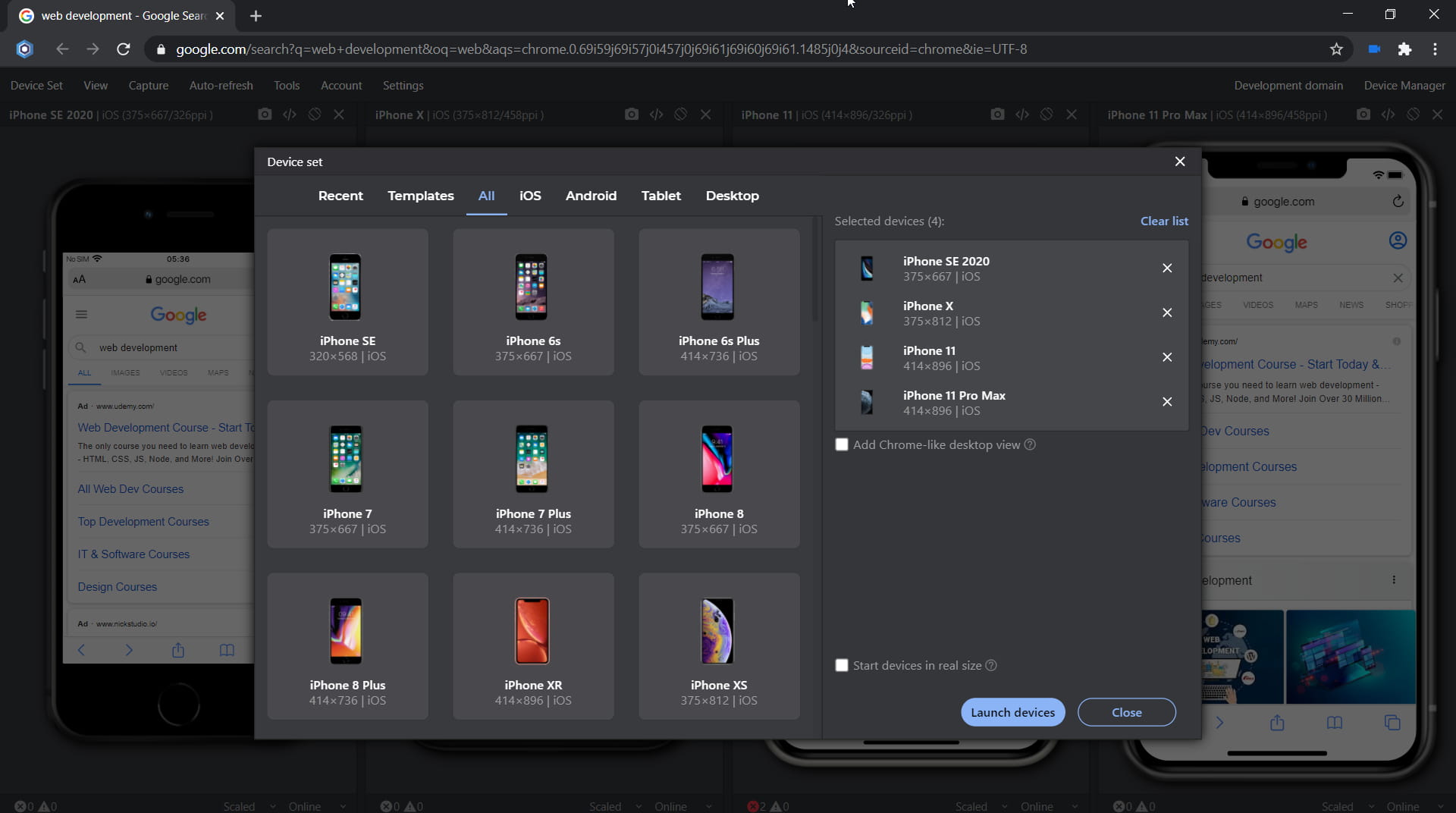
The specifications, viewport size, screen size, pixels per inch (PPI), and CSS Pixel Ratio for new devices are available on the Device portal, where you can find the device metrics for all devices including the latest iPhone 15 series:How to run a mobile test on iPhone 15, iPhone 15 Plus, iPhone 15 Pro, iPhone 15 Pro Max:
- Download Blisk or update to the latest version.
- Launch the Developer Mode from the Toolbar (screenshot below).
- Click Device Manager (screenshot below).
- Select iPhone 15, iPhone 15 Plus, iPhone 15 Pro, iPhone 15 Pro Max from the list.
- Click Launch Devices.
Learn more about Developer Mode, Development Domain, and Device Manager on Blisk Documentation.
What mobile tests you can run on iPhone 15, iPhone 15 Plus, iPhone 15 Pro, iPhone 15 Pro Max in Blisk:
Responsive test:
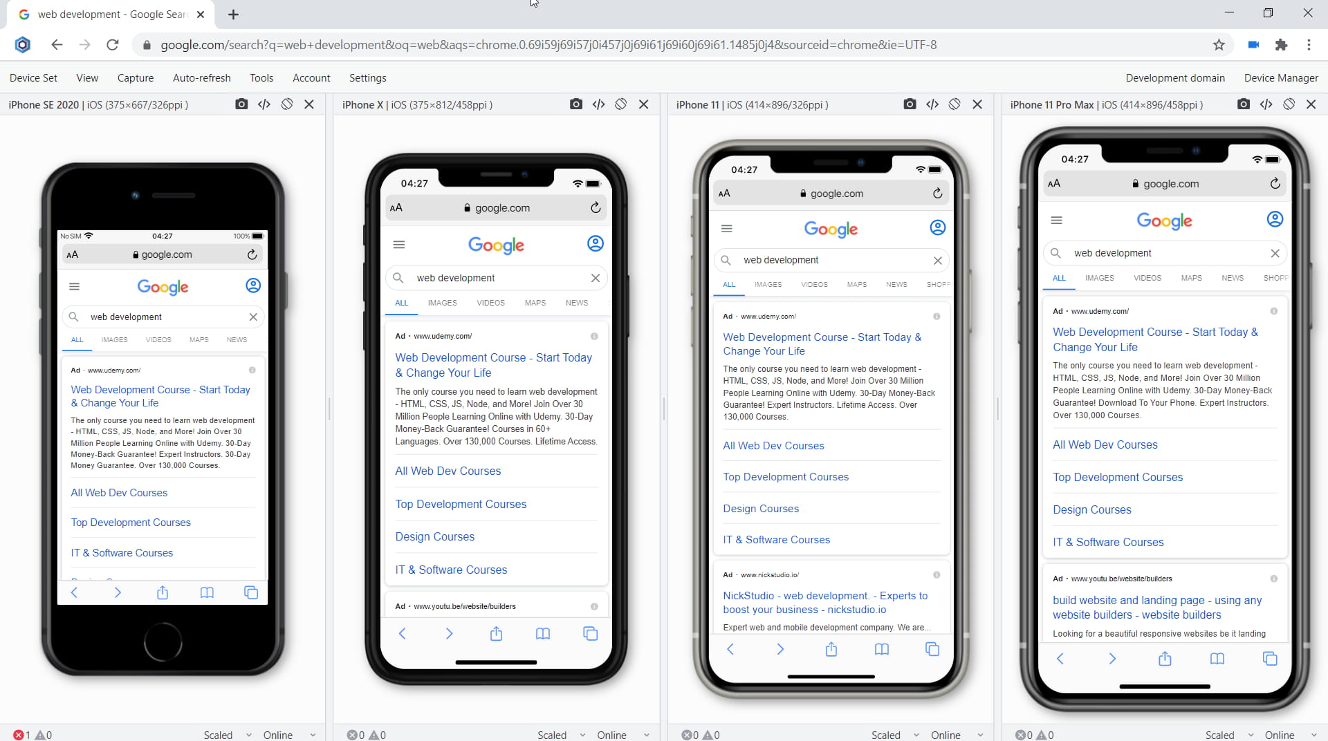
Test whether your website supports responsive design and looks great on the latest Apple mobile devices. Such a mobile test will help to find issues with the responsive layout and issues with user experience on mobile devices. So now you can test responsive design on iPhone 15, iPhone 15 Plus, iPhone 15 Pro, iPhone 15 Pro Max and compare the layout with laptops, desktops, and iPads.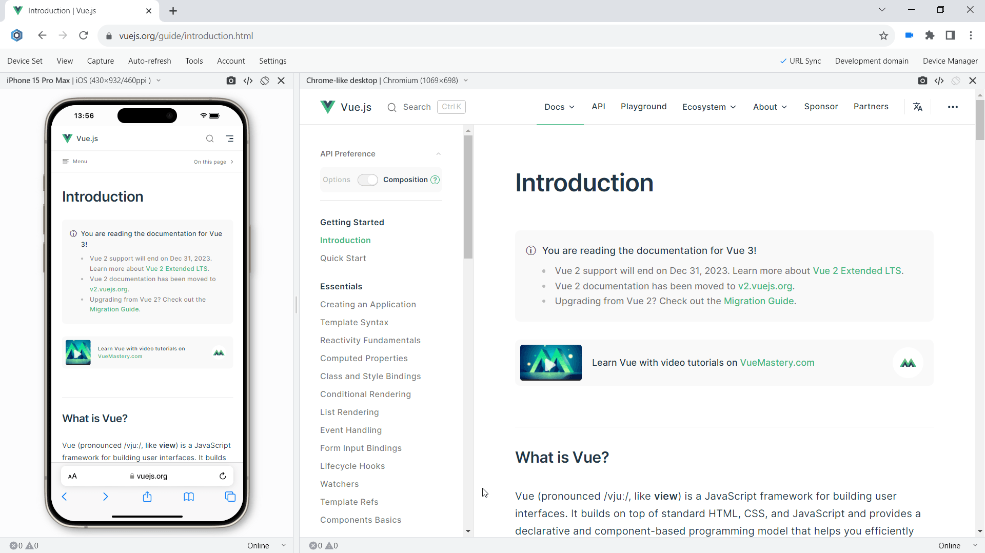
Multi-device test:
Test your new iPhone or use it with other devices such as other iOS and Android mobile phones, iPadOS tablets, Windows and macOS laptops, and desktops. When you use mobile and desktop at the same time, you are running mobile and desktop tests simultaneously. It becomes much easier to compare devices side-by-side. Starting with version 19.1, you can test on iPhone 15, iPhone 15 Plus, iPhone 15 Pro, iPhone 15 Pro Max simultaneously with other devices.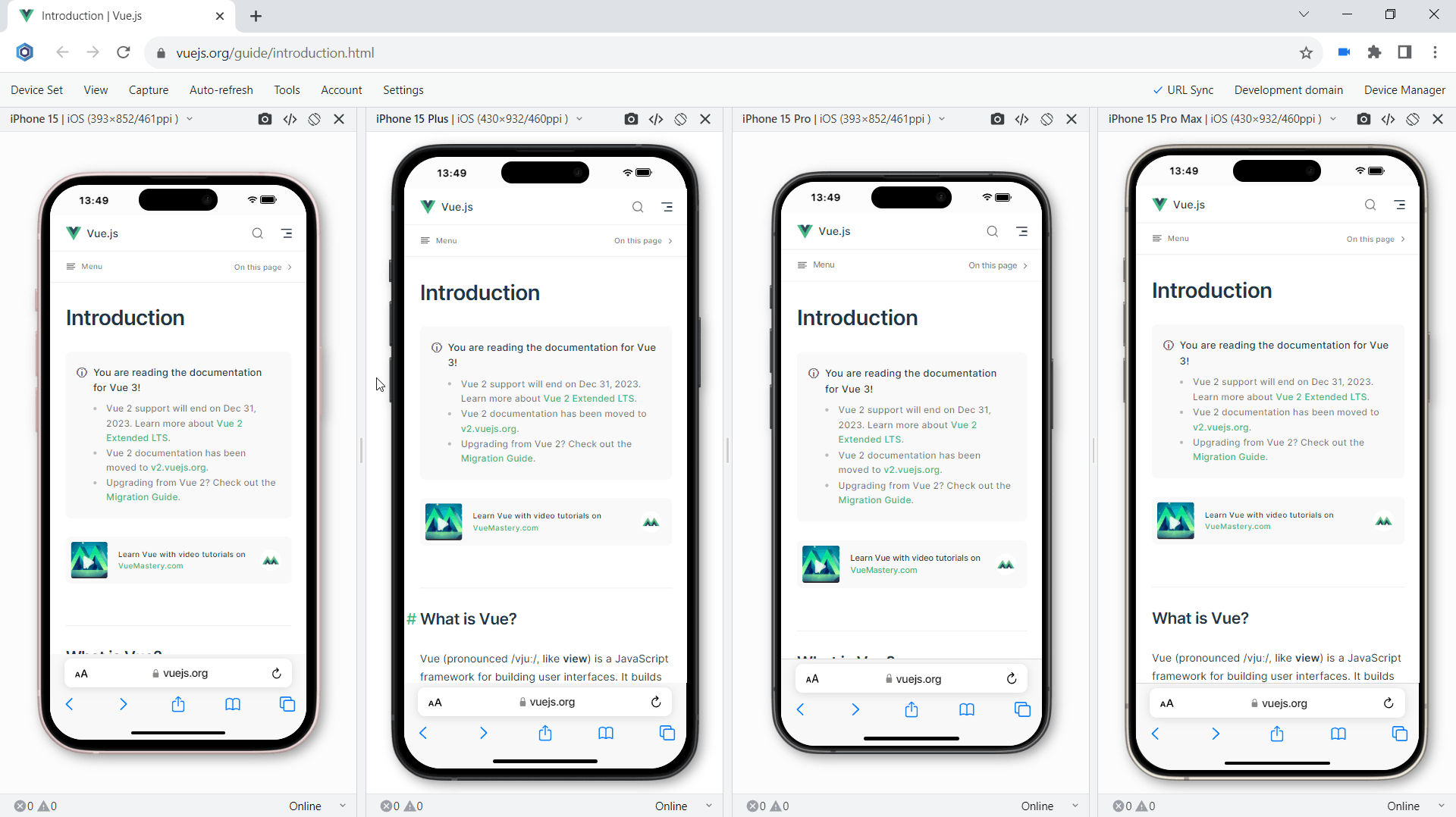
Touch events test:
Check if your website supports touch events and gestures on the iPhone 15-series. Touch is a key element in any mobile test because all interactions on mobile are done using touch. iPhone 15, iPhone 15 Plus, iPhone 15 Pro, iPhone 15 Pro Max in Blisk support touch events and gestures natively therefore you can test them easily without the need to have a mobile device. In addition, you can use Developer Tools on each device separately to track touchstart, touchend, touchcancel, or touchmove.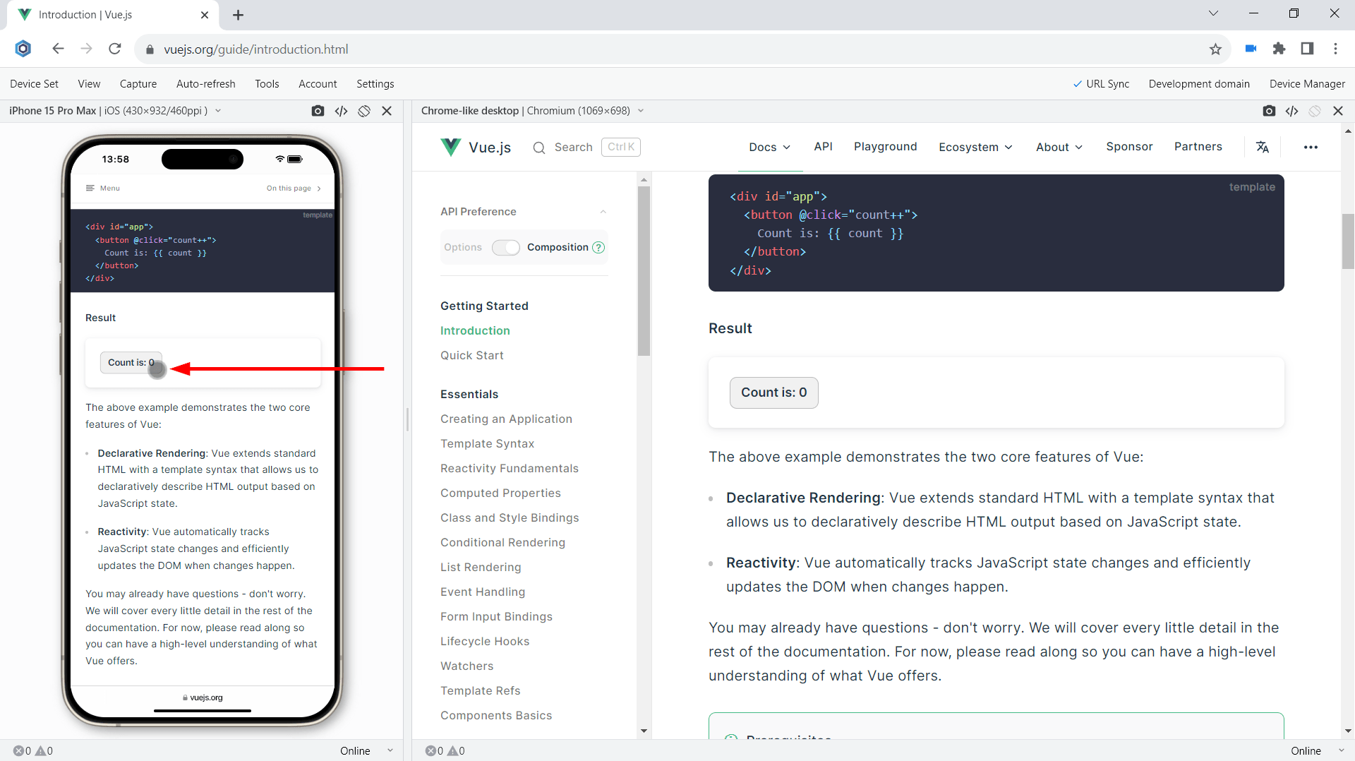
Landscape orientation test:
Test how your website behaves in landscape mode on the latest iPhones. Landscape orientation helps to find issues with layout and user experience. iPhone 15, iPhone 15 Plus, iPhone 15 Pro, iPhone 15 Pro Max in Blisk have an option to change the orientation with just one click providing the users with a clear vision of what happens on the mobile phones of the end users. Although portrait and landscape orientations differ only in that the viewport is rotated 90 degrees, their differences in size are significant. Usually, this difference is overlooked but causes issues for your users on mobile.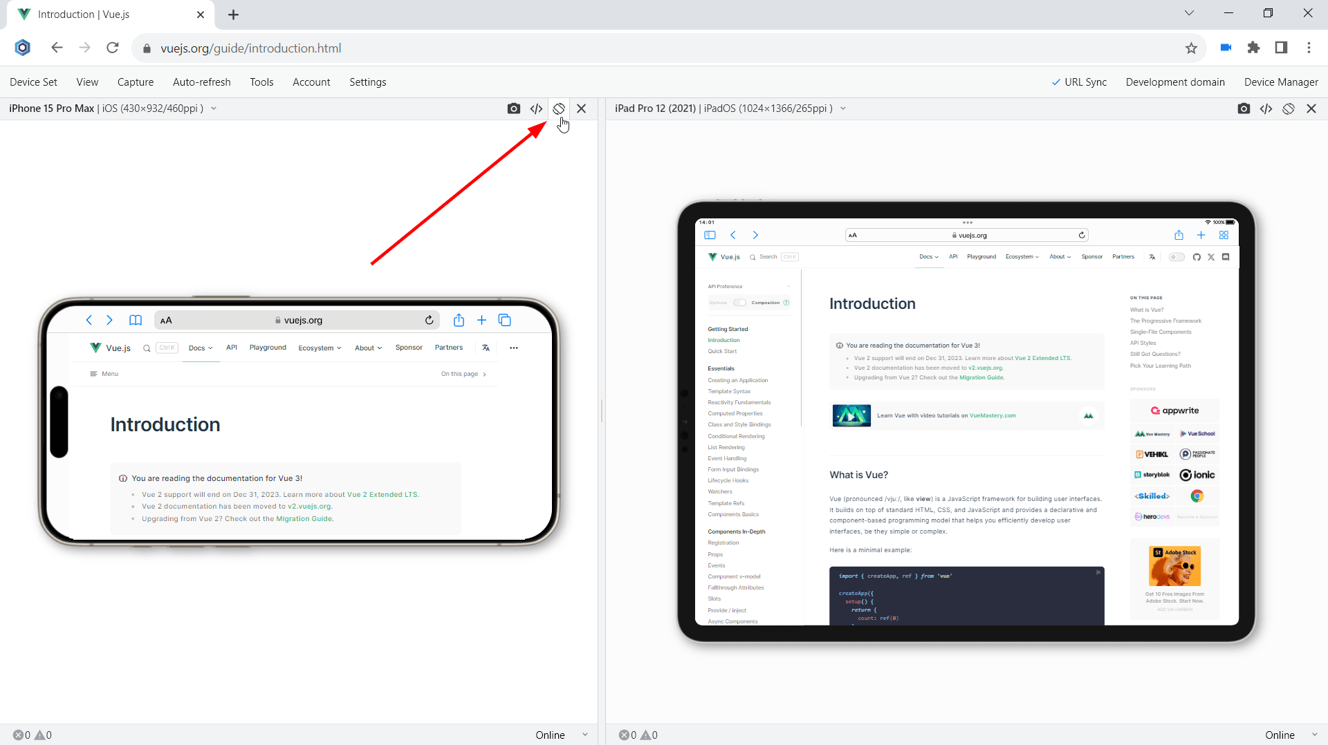
Developer Tools:
Inspect and debug your website with Developer Tools that can be run on any device. In Blisk, you can run Developer Tools on a per-device basis. This way you can use DevTools on iPhone 15, iPhone 15 Plus, iPhone 15 Pro, iPhone 15 Pro Max at the same time. With Developer Tools, you can inspect the contents of a webpage, track webpage errors, check network requests, and solve other development-related issues.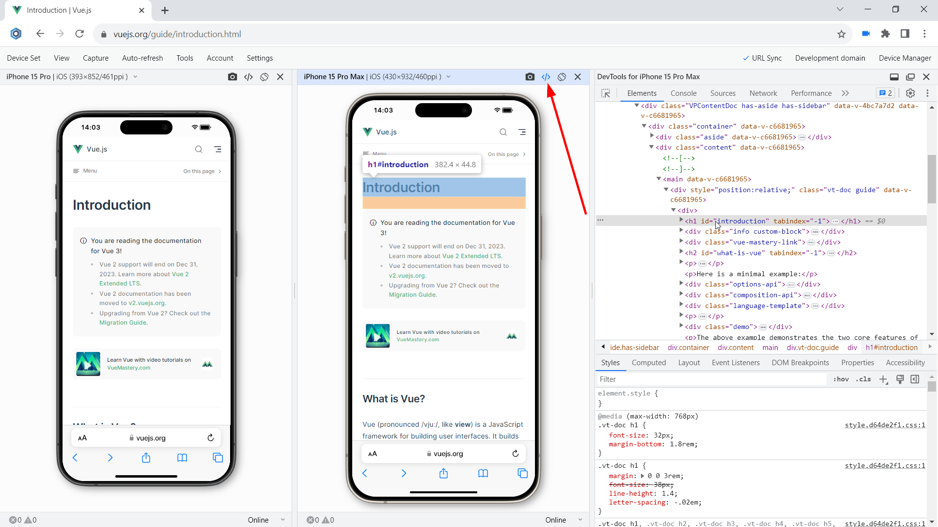
Test for webpage errors:
Monitor for webpage errors that appear on the latest iPhones and fix the issues before they become critical. The errors on mobile devices may be different from errors on desktops. Starting with version 19.1, you can track in real-time JavaScript page errors and resources that failed to load on iPhone 15, iPhone 15 Plus, iPhone 15 Pro, iPhone 15 Pro Max.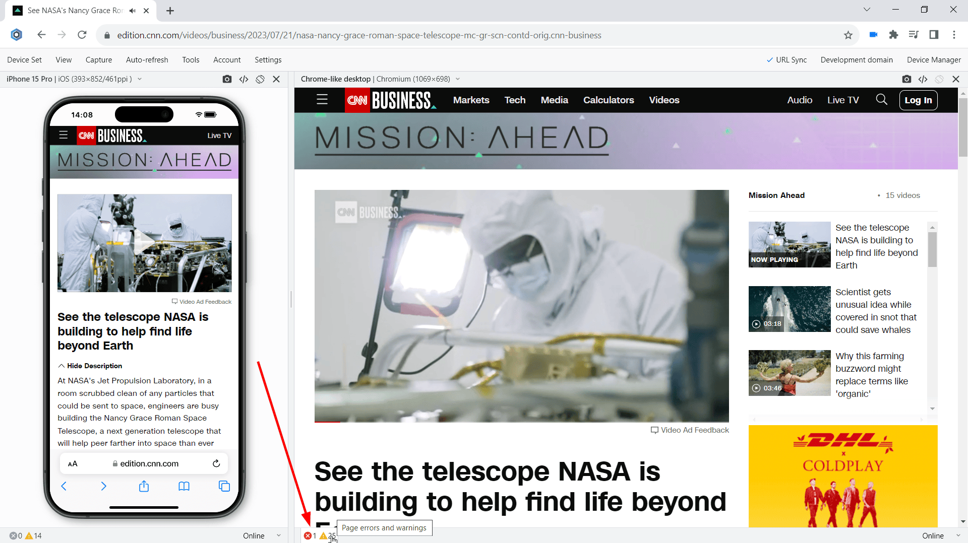
Performance test:
Run mobile tests in terms of webpage speed and performance. Webpage speed is critical on mobile, low speed leads to loss of users. Use the Network tab in the Developer Tools to conduct this important mobile test. This test is now available for the latest iPhone 15 series.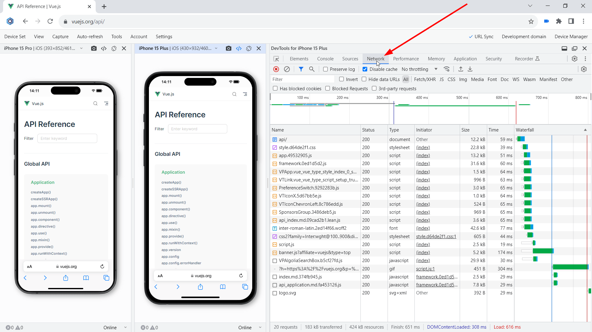
Dark mode test:
Check whether your website supports the dark mode on brand-new iPhones by running Blisk in dark mode. A lot of mobile users prefer using dark mode at nighttime. That is why the support for dark mode has become a must-have for modern applications. By enabling dark mode in Blisk, you can simulate dark mode on the latest flagships from Apple and check if the UI works well under night lighting, and check the contrast.Slow connection test:
Simulate other real-world conditions on the latest iPhones, such as a slow internet connection. In Blisk, you can simulate 2G, 3G, 4G cellular networks with Internet speeds that differ significantly. The Slow 3G setting will help you run a custom mobile test and find the resources consuming all the bandwidth on the iPhone 15 series. In addition, you can adjust the network speed on each latest iPhone differently and compare the results across a set of devices.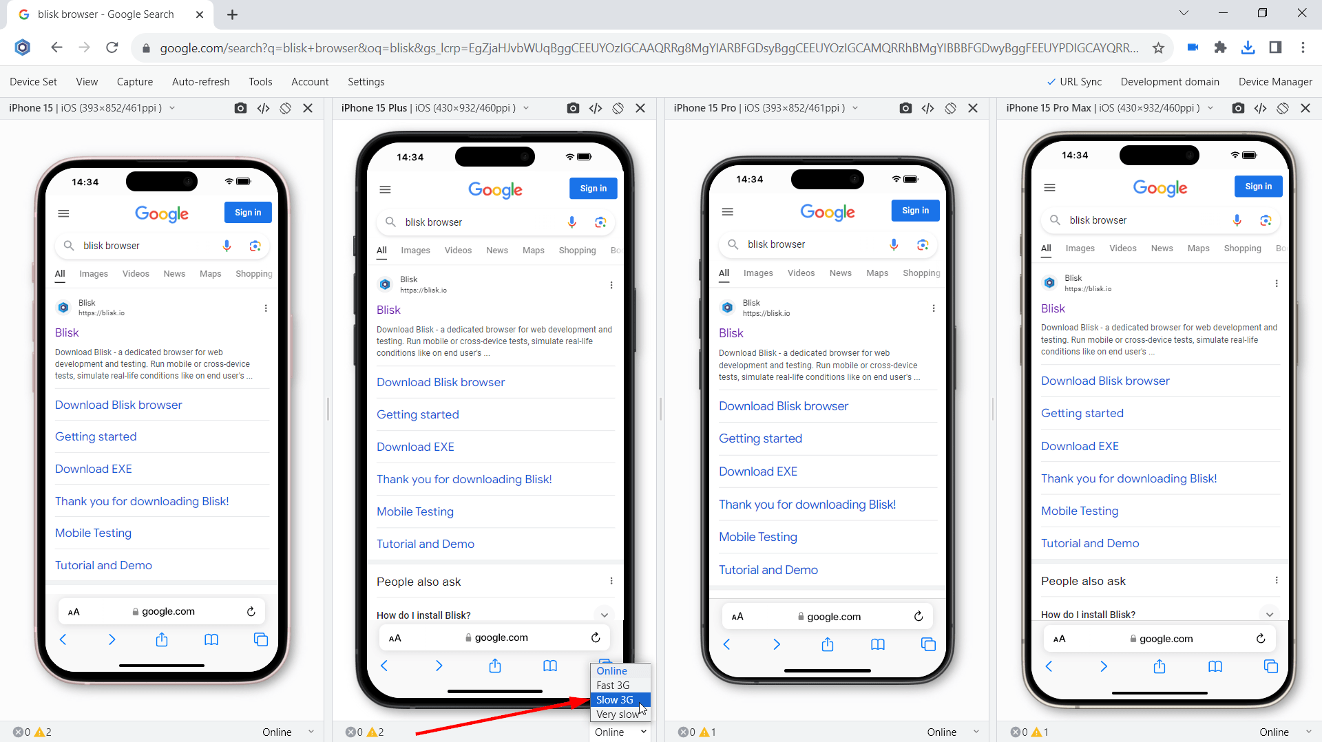
Usability test:
Test the user experience on mobile devices, uncover problems in the design, discover opportunities to improve the design, and learn about users' behavior and preferences.
Test with your teammates:
Starting with version 19.1, you can share device sets with the latest iPhone 15 series via the Blisk link (use Menu ➜ Device Set ➜ Share Device Set). Your teammate can launch the same device set and run the mobile test on the same URL and settings.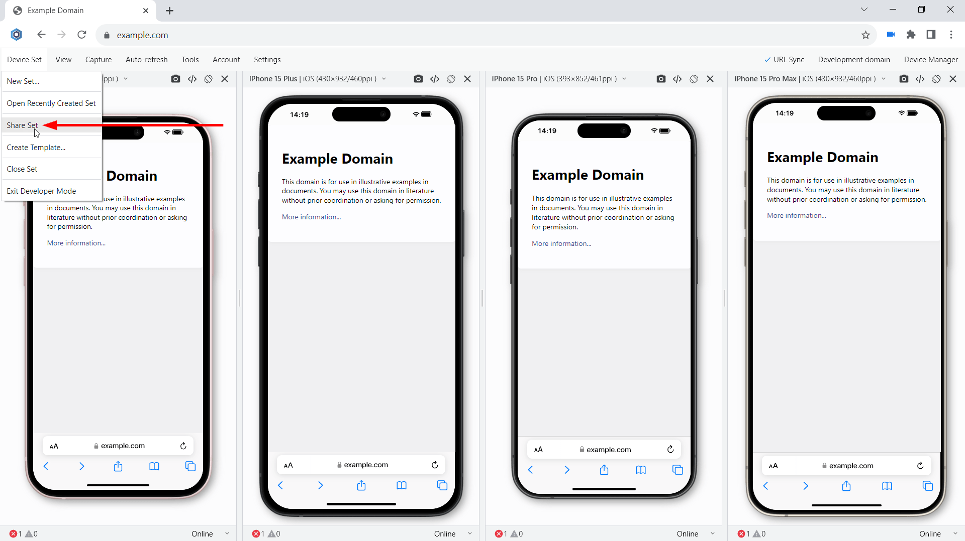
Latest technologies support and security improvements
The current platform update includes a lot of new features, including new APIs, CSS features, and security improvements. Some of the most important features are described below:
WebGPU support
WebGPU is a new API for the web, which exposes modern hardware capabilities and allows rendering and computation operations on a GPU, similar to Direct3D 12, Metal, and Vulkan. Unlike the WebGL family of APIs, WebGPU offers access to more advanced GPU features and provides first-class support for general computations on the GPU. The API is designed with the web platform in mind. It features:
- An idiomatic JavaScript API.
- Integration with promises.
- Support for importing videos.
- A polished developer experience with great error messages.
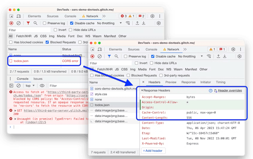
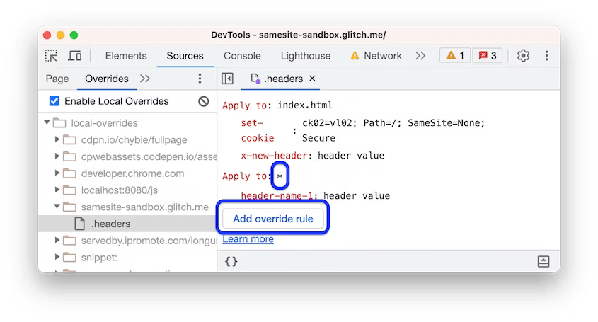
Devtools response headers override
In DevTools you can now override response headers in the Network panel. Previously, you needed access to the web server to experiment with HTTP response headers. With response header overrides, you can locally prototype fixes for various headers, including but not limited to:
- Cross-Origin Resource Sharing (CORS) Headers
- Permissions-Policy Headers
- Cross-Origin Isolation Headers
To override a header, navigate to Network > Headers > Response Headers, hover over a header's value, click Edit, and edit it.
You can also add a new header:
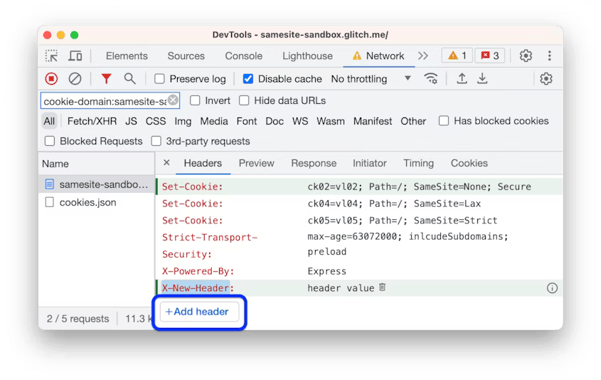
And edit all overrides in a single place.
First-Party Sets is rolling out
First-Party Sets (FPS) is starting to roll out to stable. First Party Sets is part of the Privacy Sandbox. It is a way for organizations to declare relationships among sites so that browsers allow limited third-party cookie access for specific purposes.
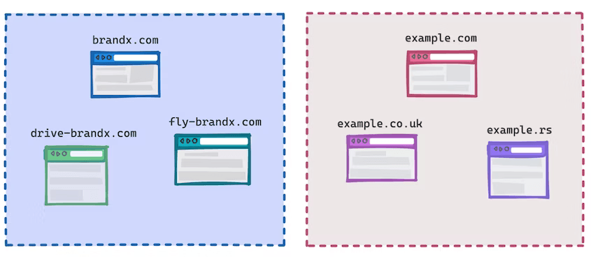
As part of the work on First-Party Sets, Chrome is implementing and extending the Storage Access API allowing a site to request access to their cookies in a third-party context. With it, organizations with related sites (for example, using different domain names, or country-specific domains) can still provide services like single sign-on or shared sessions. Remember! This API will be rolled out slowly to users over a number of weeks to enable testing and evaluation.
Overflow-inline and Overflow-block CSS media feature
The overflow-inline CSS media feature can be used to test how the output device handles content that overflows the initial containing block along the inline axis.
p {
  white-space: nowrap;
}

@media (overflow-inline: scroll) {
  p {
    color: red;
  }
}
The overflow-block CSS media feature can be used to test how the output device handles content that overflows the initial containing block along the block axis.
@media (overflow-block: scroll) {
  p {
    color: red;
  }
}
Nuxt, Vite, and Rollup debugging improvements
To help you pinpoint issues quicker during debugging, the enhanced stack trace now hides frames that come from sources generated by Nuxt 3.3 or later. DevTools skips such frames:
- In Console traces, under the Show N more frames link.
- In Sources > Call Stack, under ☑ Show ignore-listed frames.
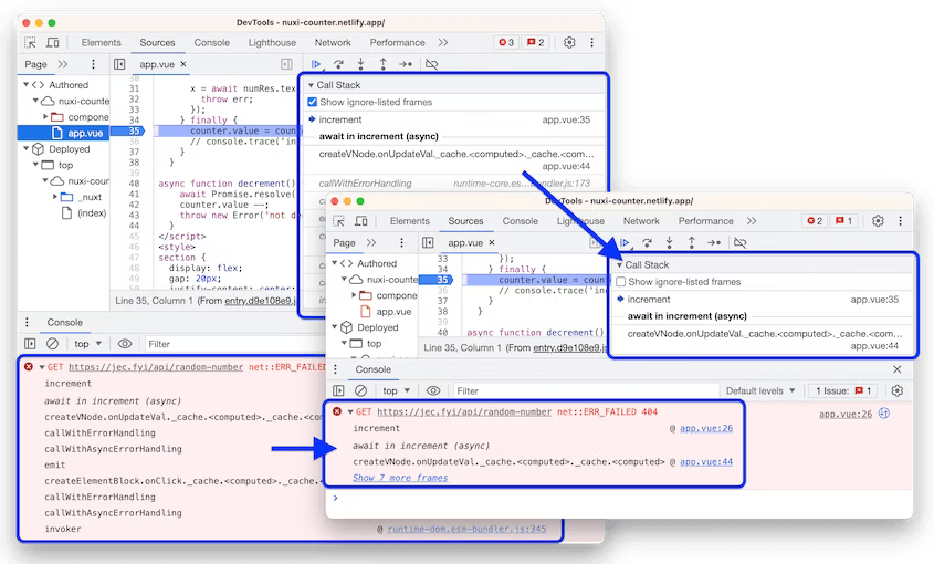
You can manually disable ignore-listing in Settings > Ignore List.
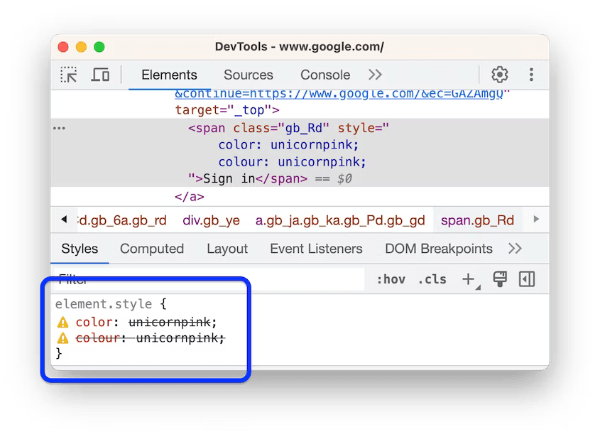
Invalid CSS properties and values
To help you diagnose CSS issues faster, the Styles pane now crosses out:
- An entire CSS declaration (property and value) when the CSS property is invalid.
- Just the value when the CSS property is valid but the value is invalid.
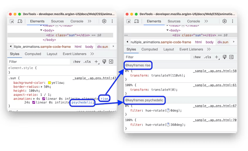
Links to key frames in the animation shorthand property
The animation shorthand CSS property now contains links to the corresponding @keyframes at-rules, so you can navigate the Styles pane faster.
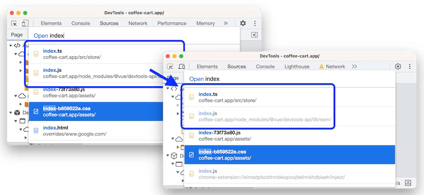
Command Menu emphasizes authored files
The quick open dialog in the Command Menu now grays out the ignore-listed third-party files to put more emphasis on the files you authored.
text-wrap:balance
Use text-wrap: balance to improve text layouts. As a developer, you don’t know the final size, font size, or even the language of the text. All variables are needed for an effective treatment of text wrapping. Since the browser does know all the factors, with text-wrap:balance you can request the browser to figure out the best balanced line wrapping solution.
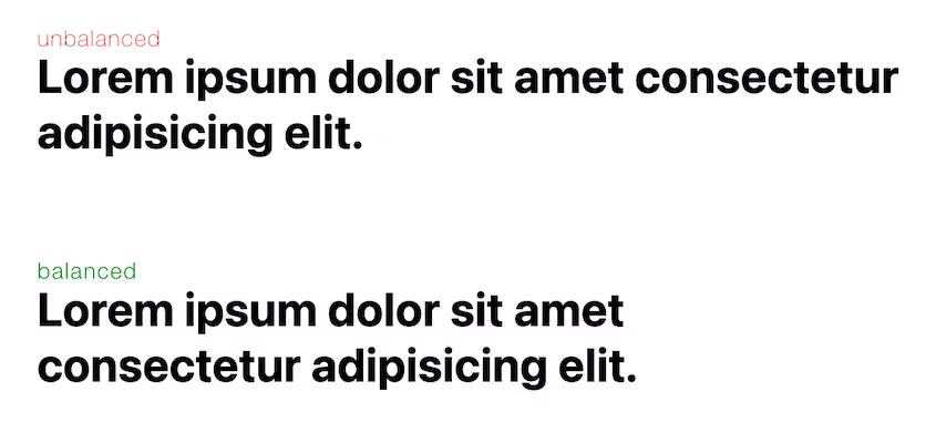
The balanced text block is more pleasing to the eye of a reader. It grabs attention better and is overall easier to read. Balancing headlines will and should be the primary use case for text-wrap: balance. There is a performance cost to balance the text, so to mitigate the cost it only works for up to four lines.
Popover API
With the Popover API, it is easier to build transient user interface (UI) elements that are displayed on top of all other web app UI. These include user-interactive elements like action menus, form element suggestions, content pickers, and teaching UI.
The new popover attribute enables any element to be displayed in the top layer automatically. This means no more worrying about positioning, stacking elements, focus, or keyboard interactions for the developer.
This is similar to the <dialog> element, but has several important differences, including light-dismiss behavior, popover interaction management, event support, and the lack of a "modal" mode.
I am a popover with more information.
Scroll driven animations
Scroll-driven animations are a common UX pattern on the web. A scroll-driven animation is linked to the scroll position of a scroll container. This means that as you scroll up or down, the linked animation goes forward or backward in direct response.
For example, you can create reading indicators that move as you scroll. Scroll-driven animations can also create elements that fade in as they come into view.
By default, an animation attached to an element runs on the document timeline. Its origin time starts at 0 when the page loads, and starts ticking forward as clock time progresses. This is the default animation timeline and, until now, was the only animation timeline you had access to.
The Scroll-driven Animations Specification defines two new types of timelines that you can use:
- Scroll Progress Timeline: a timeline that is linked to the scroll position of a scroll container along a particular axis.
- View Progress Timeline: a timeline that is linked to the relative position of a particular element within its scroll container.
<body>
    <div id="progress"></div>
  …
</body>
@keyframes grow-progress {
  from { transform: scaleX(0); }
  to { transform: scaleX(1); }
}

#progress {
  position: fixed;
  left: 0; top: 0;
  width: 100%; height: 1em;
  background: red;

  transform-origin: 0 50%;
  animation: grow-progress auto linear;
  animation-timeline: scroll();
}
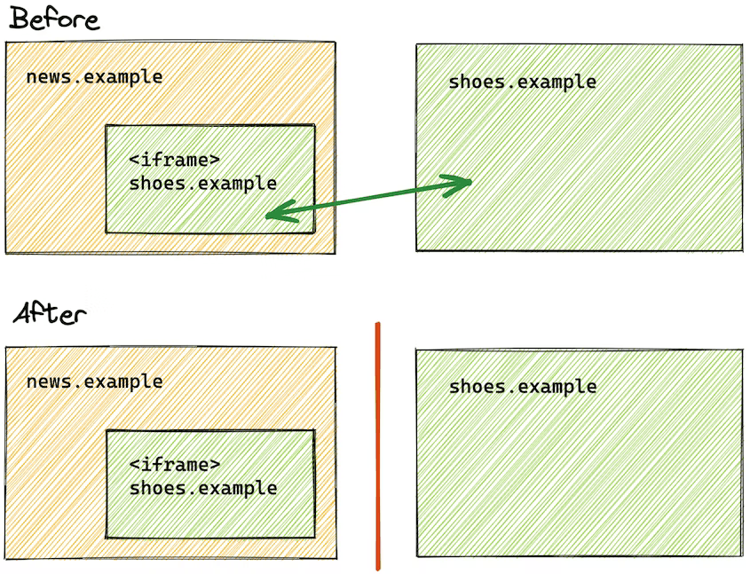
Fenced Frames
Fenced frames work in combination with other Privacy Sandbox proposals to display documents from different storage partitions within a single page.
A fenced frame is an HTML element for embedded content, similar to an iframe. Unlike iframes, a fenced frame limits communication with its embedding context to allow the frame access to cross-site data without sharing it with the embedding context.
Similarly, any first-party data in the embedding context cannot be shared with the fenced frame.
For example, let's say news.example (the embedding context) embeds an ad from shoes.example in a fenced frame. news.example cannot exfiltrate data from the shoes.example ad, and shoes.example cannot learn first-party data from news.example.
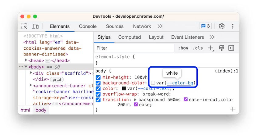
Values of custom CSS properties in tooltips
In Elements > Styles, hover over a custom CSS property name to see its value in a tooltip.
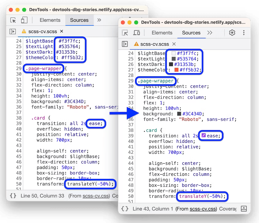
CSS syntax highlighting
The Sources panel gets the following for preprocessed CSS files, such as SASS, SCSS, and LESS:
- Syntax highlighting.
- Inline editors support. These editors are similar to those in Elements > Styles, for example, Color Picker and Easing Editor.
Network > Response pretty-printing by default
The Network > Response pane now pretty-prints minified response bodies by default, similar to the Sources panel.
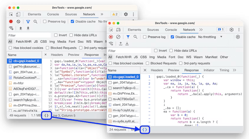
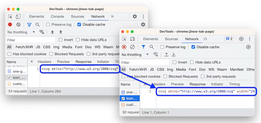
Additionally, SVG files get syntax highlighting.
Document Picture-in-Picture API
The Document Picture-in-Picture API makes it possible to open an always-on-top window that can be populated with arbitrary HTML content.
The Picture-in-Picture window in the Document Picture-in-Picture API is similar to a blank same-origin window opened using window.open(), with some differences:
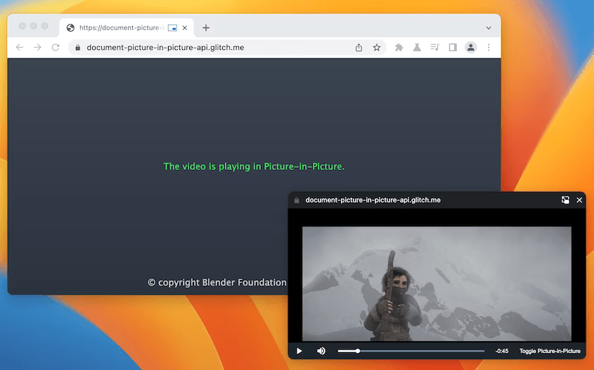
- The Picture-in-Picture window floats on top of other windows.
- The Picture-in-Picture window never outlives the opening window.
- The Picture-in-Picture window cannot be navigated.
- The Picture-in-Picture window position cannot be set by the website.
The following HTML sets up a custom video player and a button element to open the video player in a Picture-in-Picture window.
<div id="playerContainer">
    <div id="player">
    <video id="video"></video>
  </div>
</div>

<button id="pipButton">Open Picture-in-Picture window</button>
The following JavaScript calls documentPictureInPicture.requestWindow() when the user clicks the button to open a blank Picture-in-Picture window. The returned promise resolves with a Picture-in-Picture window JavaScript object. The video player is moved to that window using append().
pipButton.addEventListener('click', async () => {
  const player = document.querySelector("#player");

  // Open a Picture-in-Picture window.
  const pipWindow = await documentPictureInPicture.requestWindow();

  // Move the player to the Picture-in-Picture window.
  pipWindow.document.body.append(player);
});
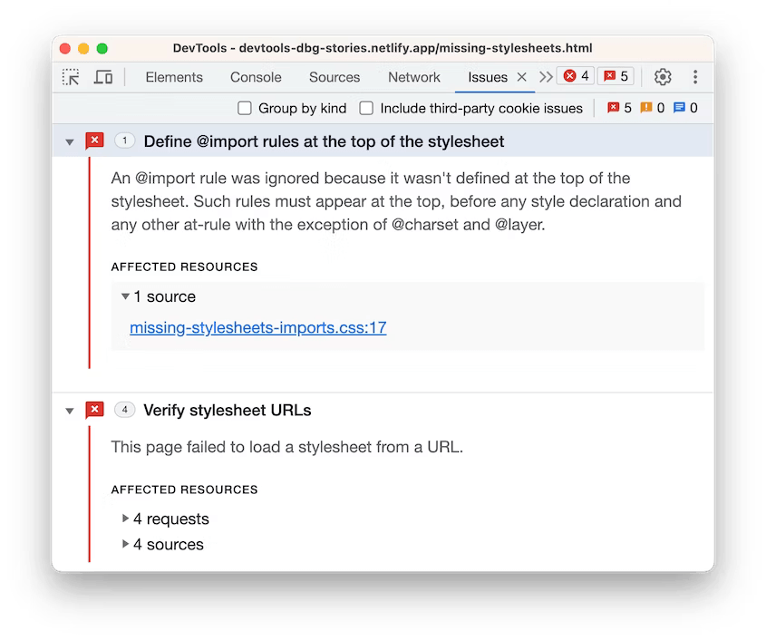
Improved debugging of missing stylesheets
DevTools gets a number of improvements to help you identify and debug issues with missing stylesheets faster:
- The Sources > Page tree now shows only the successfully deployed and loaded stylesheets to minimize confusion.
-
The Sources > Editor now underlines and shows inline error tooltips next to failed
@import,url(), andhrefstatements.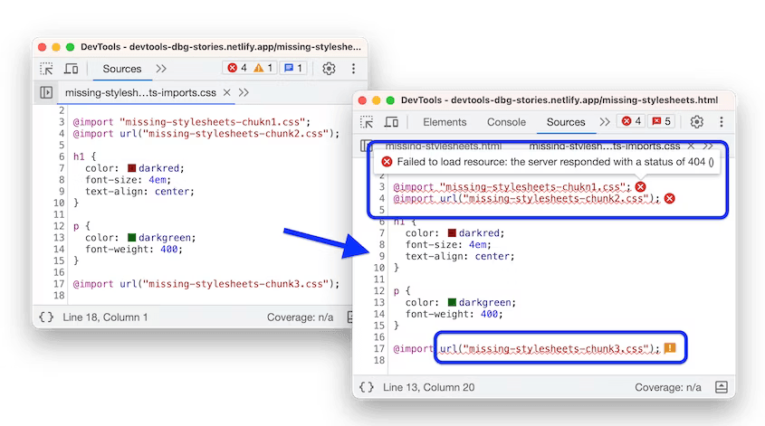
-
The Console, in addition to links to failed requests, now provides links to the exact line that references a stylesheet that failed to load.
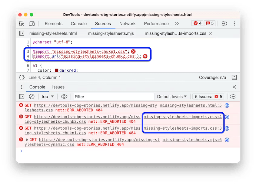
- The Network panel consistently populates the Initiator column with links to the exact line that references a stylesheet that failed to load.
-
The Issues panel lists all stylesheets loading issues, including broken URLs, failed requests, and misplaced
@importstatements.