We are excited to release the new features: New Android mobiles and desktops (including iMac 4k and 5k), and platform update (latest technologies and security improvements).
Important: learn more about the new workflow in our new Getting Started Guide.
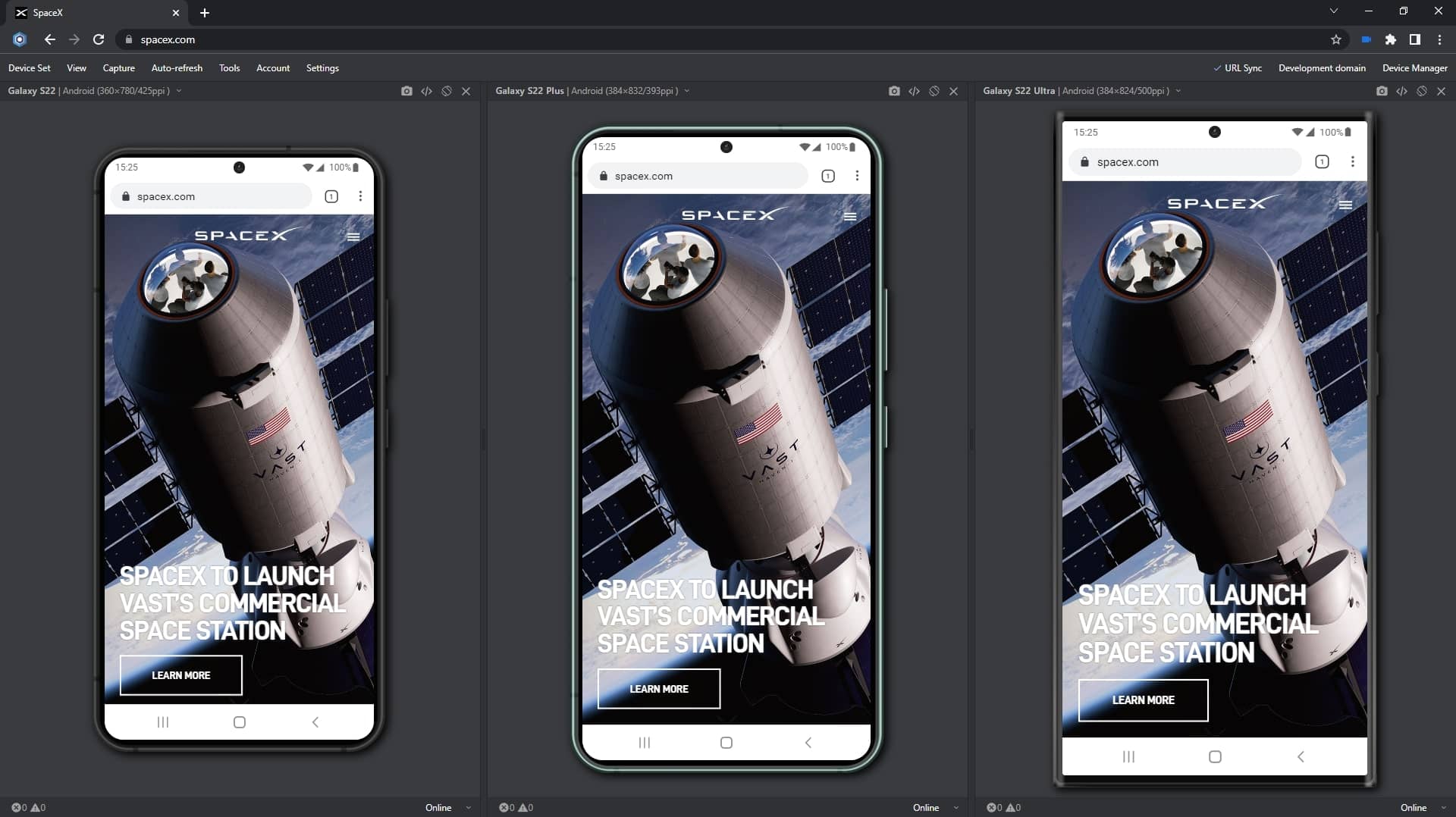
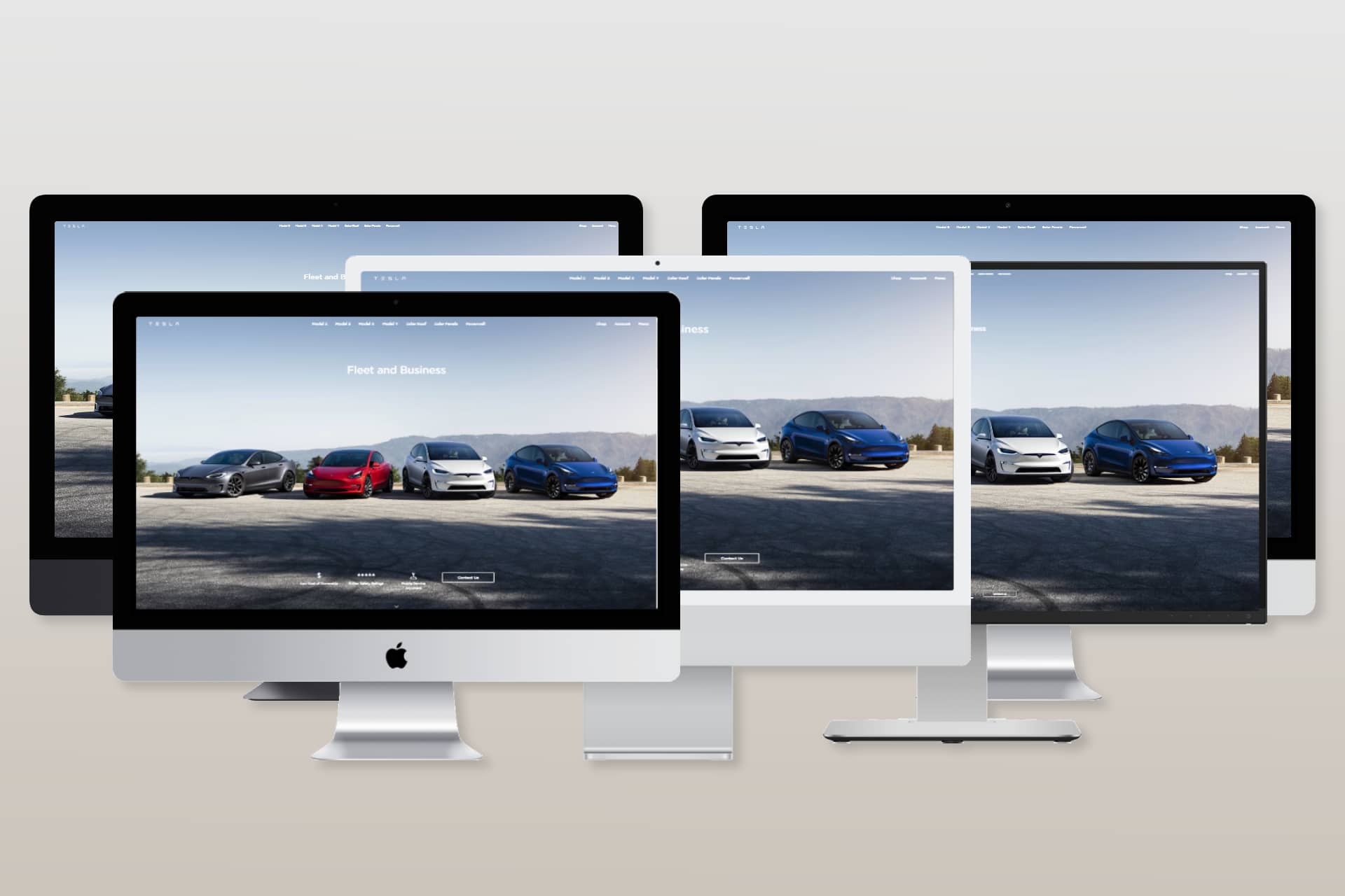
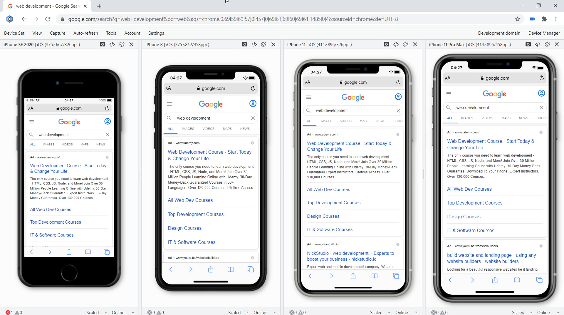
New devices in Blisk
Samsung Galaxy S22, Samsung Galaxy S22 Plus, Samsung Galaxy S22 Ultra, Desktop 4k 1x scale, iMac Pro Retina 5K 27″, iMac Retina 4․5K 24″, iMac Retina 4K 21․5″, iMac Retina 2016 27″ are ready to use in the Blisk app, where you can run a mobile test, a responsive test, or a cross-device test. These devices are preinstalled in the Blisk app, so you don't need to download or install anything other than the Blisk app. The new devices run directly on your PC, Mac, or Linux, and the code runs locally, avoiding potential data loss or security issues.
Requirements: this feature is available in Blisk v.20.0.176.140 and later. You may need to update the Blisk application to use this feature. View Documentation.
Starting with v.20.0.176.140, Blisk opens new possibilities for running different kinds of mobile tests on Samsung Galaxy S22, Samsung Galaxy S22 Plus, Samsung Galaxy S22 Ultra, Desktop 4k 1x scale, iMac Pro Retina 5K 27″, iMac Retina 4․5K 24″, iMac Retina 4K 21․5″, iMac Retina 2016 27″: responsive test, multi-device test, touch events test, performance test, landscape orientation test, dark mode test, test for page errors, slow Internet connection test, etc.

Galaxy S22-series and new desktops: Screen size, Viewport, Pixel Ratio, CSS Media Query, and specification
The specifications, viewport size, screen size, pixels per inch (PPI), and CSS Pixel Ratio for new devices are available on the Device portal, where you can find the device metrics for all devices including the latest Galaxy S22-series and desktops:- Samsung Galaxy S22 viewport, resolution, and specs
- Samsung Galaxy S22 Plus viewport, resolution, and specs
- Samsung Galaxy S22 Ultra viewport, resolution, and specs
- Desktop 4K 1X Scale viewport, resolution, and specs
- iMac Pro Retina 5K 27″ viewport, resolution, and specs
- iMac Retina 4․5K 24″ viewport, resolution, and specs
- iMac Retina 4K 21․5″ viewport, resolution, and specs
How to run a mobile test on Samsung Galaxy S22, Samsung Galaxy S22 Plus, Samsung Galaxy S22 Ultra, Desktop 4k 1x scale, iMac Pro Retina 5K 27″, iMac Retina 4․5K 24″, iMac Retina 4K 21․5″, iMac Retina 2016 27″:
- Download Blisk or update to the latest version.
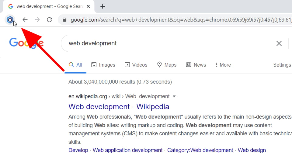
- Launch the Developer Mode from the Toolbar (screenshot below).
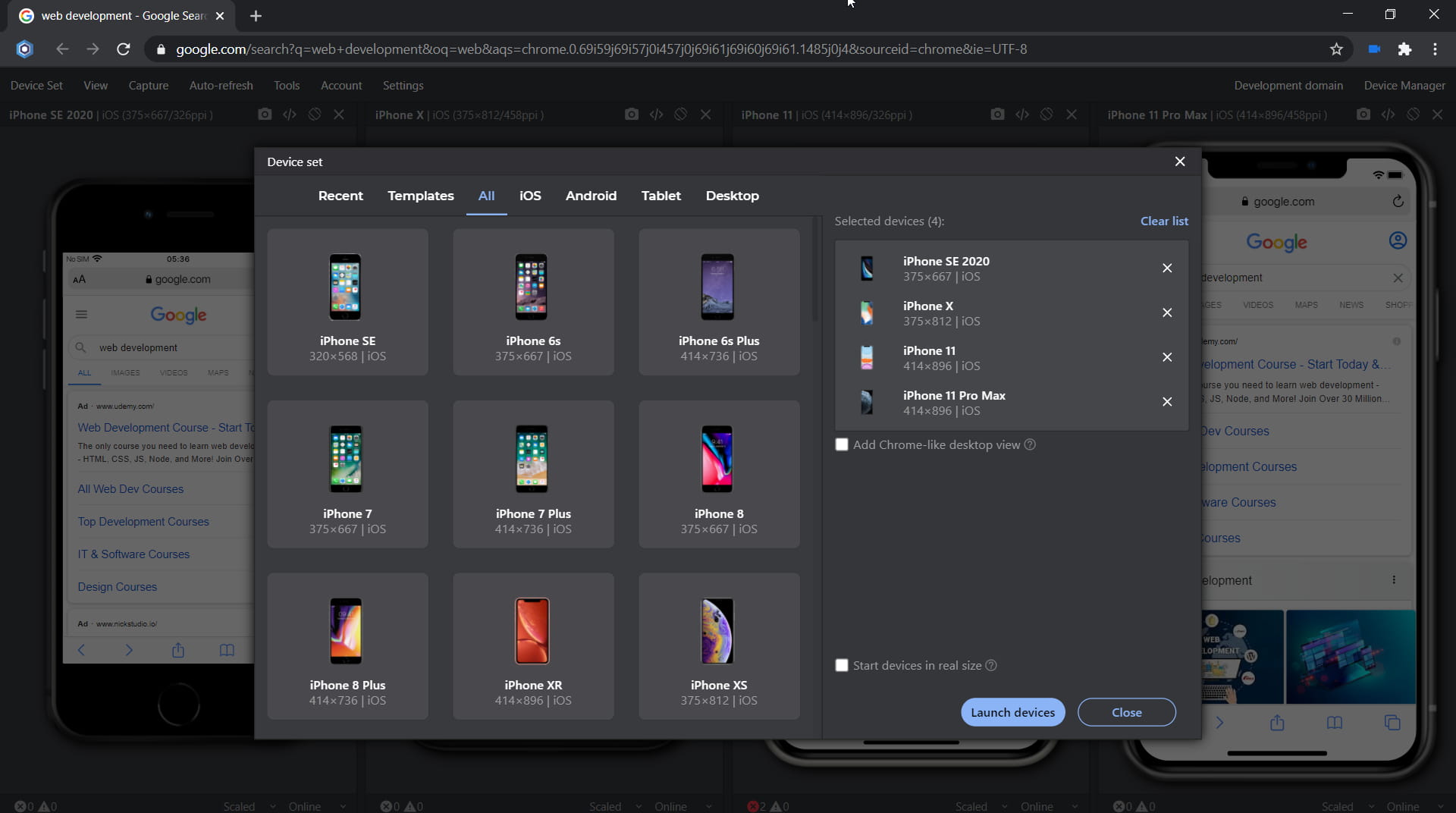
- Click Device Manager (screenshot below).
- Select Samsung Galaxy S22, Samsung Galaxy S22 Plus, Samsung Galaxy S22 Ultra, Desktop 4k 1x scale, iMac Pro Retina 5K 27″, iMac Retina 4․5K 24″, iMac Retina 4K 21․5″, iMac Retina 2016 27″ from the list.
- Click Launch Devices.
Latest technologies support and security improvements
The current platform update includes a lot of new features, including new APIs, CSS features, and security improvements. Some of the most important features are described below:
- Fetch Priority
- CSS Color Adjust: 'only' keyword for color-scheme
- HDR CSS Media Queries: dynamic-range
- New window.open() popup vs. window behavior
- Autofill in ShadowDOM
- CSS cascade layers
- Support of text-emphasis properties
- Allow cookie domain attributes to be the empty string
- Secure context fix for dedicated workers
- Inert attribute
- Navigation API
- AbortSignal.timeout() Static Method
- CSS object-view-box
- Individual Properties for CSS Transforms
- Support visual-box on overflow-clip-margin
- CSS :has() pseudo-class
- CSS :modal pseudo-class
- CSS Container Queries
- CSS 'lh' Length Unit
- CSS Root Font Units: 'rex', 'rch', 'ric', 'rlh'
- DevTools: Properties pane filter
- DevTools: Show rulers on hover command
- DevTools: Support row-reverse and column-reverse in the Flexbox editor
- DevTools: New Reporting API pane
- DevTools: New console group filter
- DevTools: View and edit @supports at rules in the Styles pane
- DevTools: Preview class/function properties on hover
- DevTools: Partially presented frames in the Performance panel
- DevTools: Support for the hwb() color function
- DevTools: Improved private properties
- DevTools: Handle script execution errors in the Console
- DevTools: Picking a color outside of the browser
- DevTools: Reveal assigned slot of an element
- DevTools: CSS variables improvements
- DevTools: Source maps improvements
- DevTools: Protocol handlers in the Manifest pane
Fetch Priority
Fetch Priority gives you a way to hint to the browser which order resources should be downloaded in, by using the fetchpriority attribute. This accepts values of "high", "low", and "auto".
-
"high": You consider the resource a high priority and want the browser to prioritize it as long as the browser's heuristics don't prevent that from happening. -
"low": You consider the resource a low priority and want the browser to deprioritize it if its heuristics permit. -
"auto": This is the default value that lets the browser decide the appropriate priority.
In the example below, a low-priority image is indicated with fetchpriority="low".
<img src="/images/in_viewport_but_not_important.svg" fetchpriority="low" alt="I'm an unimportant image!">
CSS Color Adjust: 'only' keyword for color-scheme
The only keyword has been re-added to the specification color-scheme as a way of per-element opt-out of color-scheme override like forced darkening.
-
div { color-scheme: light }will force the div element into color-scheme dark and apply forced darkening. -
div { color-scheme: only light }will keep the color-scheme for the element light and opt-out of forced darkening.
This feature can be used to do per-element opt-out of color-scheme overrides like forced darkening.
HDR CSS Media Queries: dynamic-range
This feature adds a media query to CSS which allows a page to detect the current display device’s support for HDR.
This feature adds the query: dynamic-range which may be one of standard or high. Blisk will resolve this query according to the capabilities of the display device the browser window is currently positioned on, allowing pages to toggle CSS rules accordingly or respond in Javascript via window.matchMedia().
As HDR-supported displays become more common, web developers need ways to enable HDR content on their web pages without compromising the experience for users of non-HDR displays, or mixed-HDR multi-display setups. CSS already provides the 'media query' concept for toggling rules based on display device characteristics, and this feature extends that set of queries to enable detecting HDR support on the current display device.
New window.open() popup vs. window behavior
This change aligns Blisk with the spec for window.open(), by:
1. Adding a "popup" windowFeature to control popup vs. tab/window.
2. Ensuring all BarProp properties return !is_popup.
The window.open() API is currently confusing to use, in terms of trying to get it to open a popup vs. a tab/window. This change simplifies the usage by adding a single boolean argument called popup that works as you'd expect: popup=1 gets you a popup, and popup=0 gets a tab/window:
const popup = window.open('_blank','','popup=1');
const tab = window.open('_blank','','popup=0');
This is an interop-driven change, to align Blisk with the newly-landed spec for window.open. It does not change existing behavior around whether a popup or tab/window is opened, to avoid issues.
Autofill in ShadowDOM
This feature allows autofill to look into ShadowDOM when collecting form controls within a form element.
With the adoption of web components, it is common to wrap form controls like input elements in ShadowDOM. When autofill traverses the children of form elements to collect form controls, it currently skips ShadowDOM, and makes these form controls never get autofilled. This feature makes autofill also traverse into ShadowDOM when collecting form controls.
CSS cascade layers
CSS cascade layers (@layer rule and layered @import syntax) provide a structured way to organize and balance concerns within a single origin. Rules within a single cascade layer cascade together without interleaving with style rules outside the layer. This allows authors to achieve a certain cascade ordering for same-origin rules in a proper way.
Cascade layers allow authors to create layers to represent element defaults, third-party libraries, themes, components, overrides, and etc.—and are able to re-order the cascade of layers in an explicit way. Without cascade layers, currently, authors need to tweak, e.g., selector specificity, !import or source ordering to achieve a certain cascade ordering, which is cumbersome and error-prone.
Support of text-emphasis properties
This feature introduces 'text-emphasis, text-emphasis-color, text-emphasis-position, and text-emphasis-style CSS properties. They are unprefixed versions of -webkit-text-emphasis, -webkit-text-emphasis-color, -webkit-text-emphasis-position, and -webkit-text-emphasis-style.
Allow cookie domain attributes to be the empty string
This feature updates the parsing of cookie strings to allow a cookie's domain attribute to be set to the empty string. This change will also correct the failing web-platform tests related to an empty string domain. Additionally, it brings Blisk in alignment with the draft RFC6265bis specification and will improve interoperability with Chrome, Safari, and Firefox by matching their treatment of an empty cookie domain attribute.
Secure context fix for dedicated workers
Dedicated workers loaded from a secure (HTTPS) origin yet instantiated by insecure (non-HTTPS) contexts are no longer considered secure. This results in the following web developer-facing changes inside such worker contexts:
-
self.isSecureContextis nowfalse. -
self.cachesandself.storageFoundationare no longer available.
This aligns Blisk behavior with the specification and Gecko.
Inert attribute
The inert attribute allows web authors to mark parts of the DOM tree as inert. When a node is inert:
-
Hit-testing must act as if the
pointer-eventsCSS property was set tonone. -
Text selection functionality must act as if the
user-selectCSS property was set tonone. - If it is editable, the node behaves as if it were non-editable.
- The user agent may ignore the node for the purposes of find-in-page.
This aligns Blisk behavior with the specification and Gecko.
Navigation API
The window.navigation API (formerly known as the app history API) provides the ability to intercept and initiate navigations, as well as introspect an application's history entries. This provides a more useful alternative to window.history and window.location, specifically aimed at the needs of single-page web applications.
The existing window.history API is hard to deal with in practice, especially for single-page applications. In the best case, developers can work around this with various hacks. In the worst case, it causes user-facing pain in the form of lost state and broken back buttons, or the inability to achieve the desired navigation flow for a web app.
AbortSignal.timeout() Static Method
Returns a new AbortSignal object that is automatically aborted after a given number of milliseconds. This method can be used by developers to easily implement timeouts for signal-accepting async APIs, e.g. fetch().
The main motivating use case for this is helping web developers easily time out async operations, such as fetch(). For example, now you can write:
fetch(url, { signal: AbortSignal.timeout(10_000) });
CSS object-view-box
Object-view-box allows the author to specify a subset within an image that should draw within the content box of the target replaced element. This enables an author to create an image with a custom glow or shadow applied, with proper ink-overflow behavior like a CSS shadow would have.
Object-view-box and object-overflow allows the author to specify a subset within an image that should draw within the content box of the target replaced element. This enables an author to create an image with a custom glow or shadow applied, with proper ink-overflow behavior like a CSS shadow would have.
Individual Properties for CSS Transforms
This adds three new CSS properties: translate, rotate, and scale. These properties are known as the individual transform properties (and were previously known as the independent transform properties). This exposes a simple way for web developers to access transforms in an intuitive way, without having to think about how functions in the transform property interact with each other. The properties can be animated individually.
Support visual-box on overflow-clip-margin
Overflow-clip-margin specifies how far an element's content is allowed to paint before being clipped. This feature allows using visual-box values to configure the reference box that defines the overflow clip edge the content is clipped to.
CSS :has() pseudo-class
The :has() pseudo-class is a selector that specifies an element which has at least one element that matches the relative selector passed as an argument.
CSS :modal Pseudo-Class
CSS :modal is a pseudo-class selector to style dialog element. The :modal pseudo-class represents an element that is in a state that excludes all interaction with elements outside it until it has been dismissed.
CSS Container Queries
Container Queries allow authors to style elements according to the size of a container element. It's similar to a @media query, except it evaluates against the size of a container instead of the size of the viewport.
CSS 'lh' Length Unit
The lh unit adds support for expressing CSS lengths relative to the line-height. That is typically useful for specifying the height of an element to fit a whole number of lines. Example: textarea { height: 5lh }
CSS Root Font Units: 'rex', 'rch', 'ric', 'rlh'
Adds root font units. Previously, only 'rem' has been supported in Blisk. This feature adds root element variants of ex, ch, ic, lh.
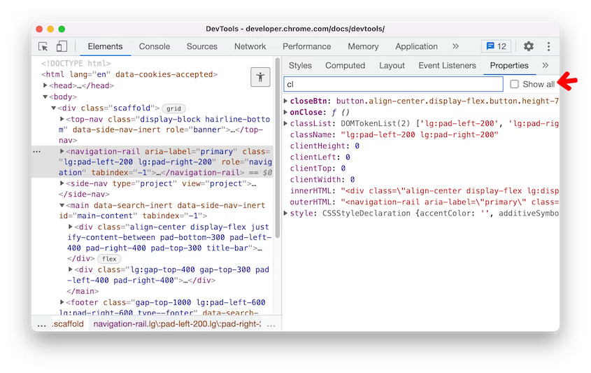
DevTools: Properties pane filter
If you want to focus on a specific property in the Properties pane, you can now type that property name or value in the new Filter textbox.
By default, properties whose value is null or undefined are not shown. Enable the Show all checkbox to view all properties.
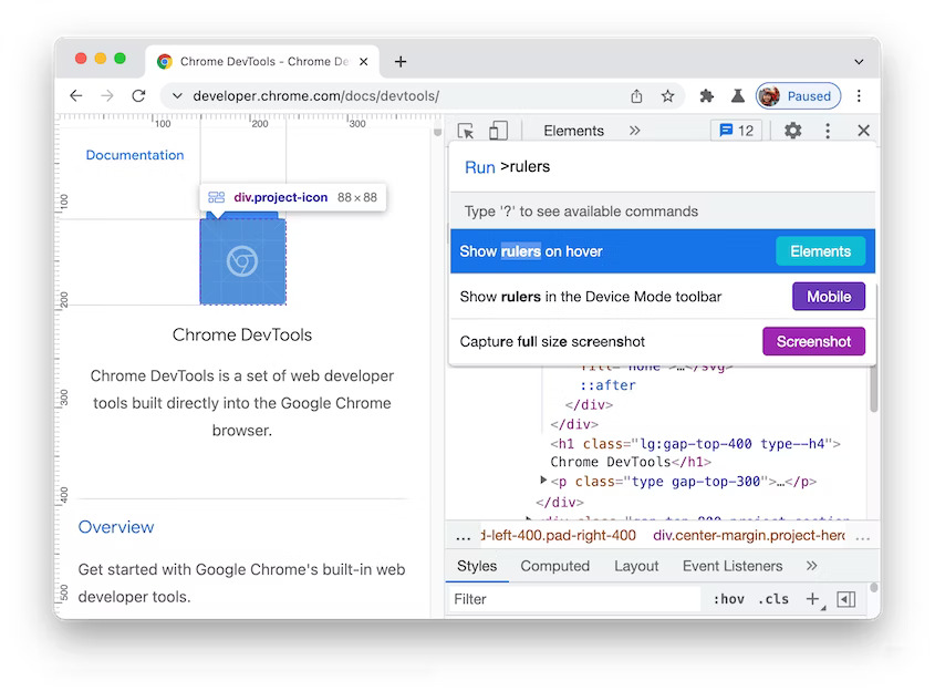
DevTools: Show rulers on hover command
You can now open the Command Menu (Ctrl+Shift+P or Cmd+Shift+P) and run the Show rulers on hover command. The page rulers make it easier to measure the width and height of an element.
Previously, you can only enable the page rulers via Settings > Show rulers checkbox.
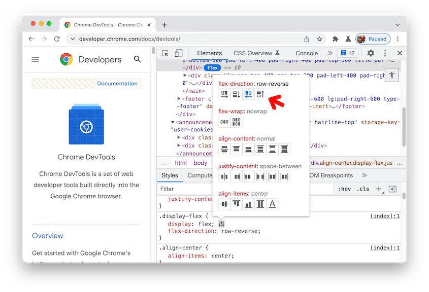
DevTools: Support row-reverse and column-reverse in the Flexbox editor
The Flexbox editor added two new buttons to support row-reverse and column-reverse in flex-direction.
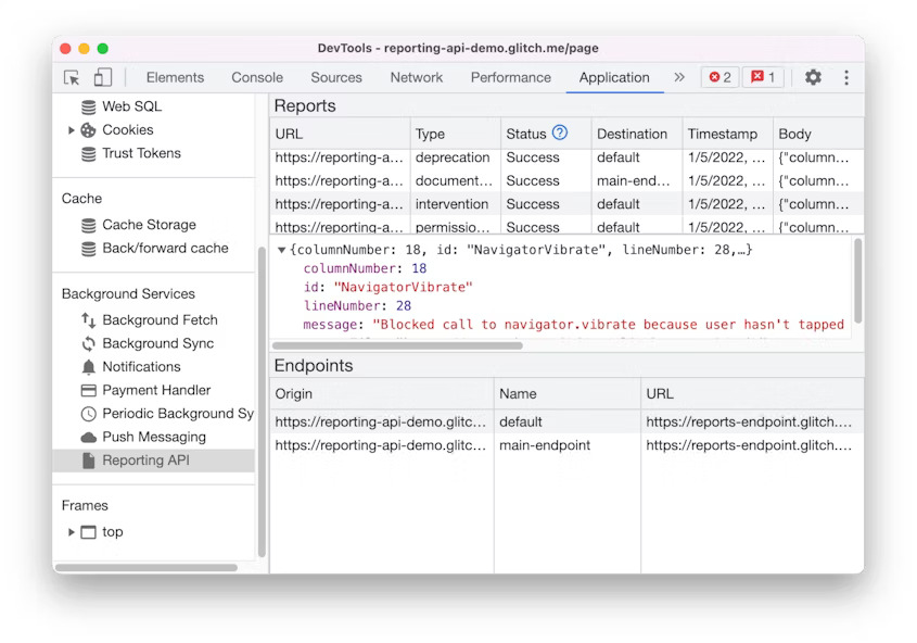
DevTools: New Reporting API pane
Use the new Reporting API pane to monitor the reports generated on your page and their status. The Reporting API is designed to help you monitor security violations of your page, deprecated API calls, and more. Open a page that uses the Reporting API. In the Application panel, scroll down to the Background services section and select the Reporting API pane.
The Reports section shows you a list of reports generated on your page and their status. Click on it to view the report’s details.
The Endpoints section gives you an overview of all the endpoints configured in the Reporting-Endpoints header.
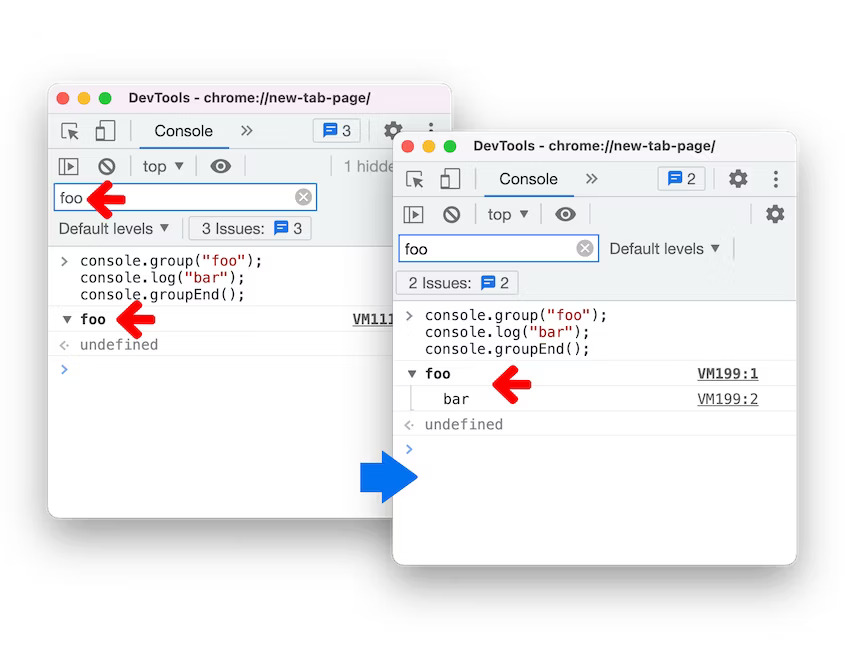
DevTools: New console group filter
When filtering the console message, a console message is now shown if its message content matches the filter or the title of the group (or the ancestor group) matches the filter. Previously, the console group title would show despite the filter.
In addition, if a console message is shown, the group (or the ancestor group) it belongs to is now shown as well.
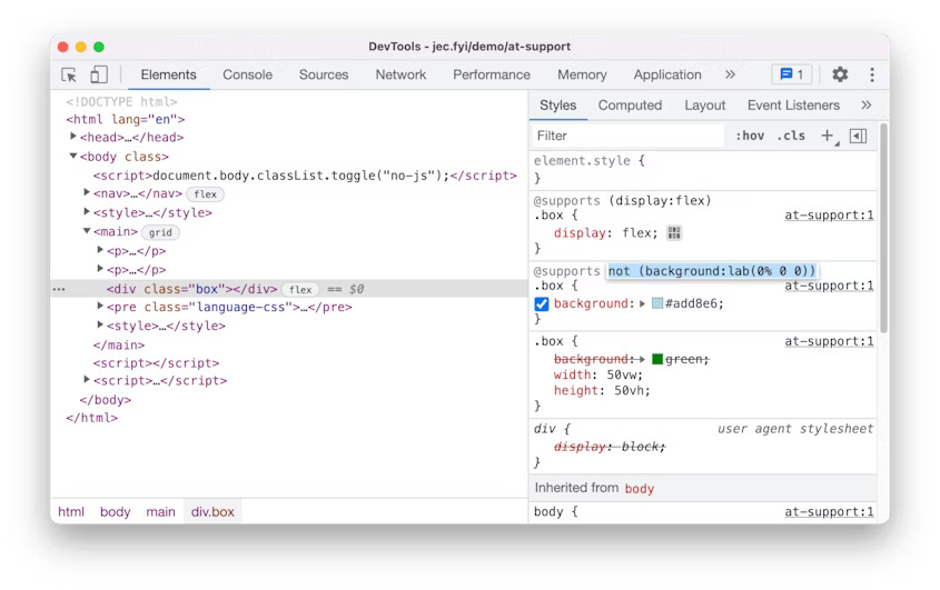
DevTools: View and edit @supports at rules in the Styles pane
You can now view and edit the CSS @supports at-rules in the Styles pane. These changes make it easier to experiment with the at-rules in real-time. Open this demo page, inspect the <div class=”box”> element, and view the @supports at-rules in the Styles pane. Click on the rule’s declaration to edit it.
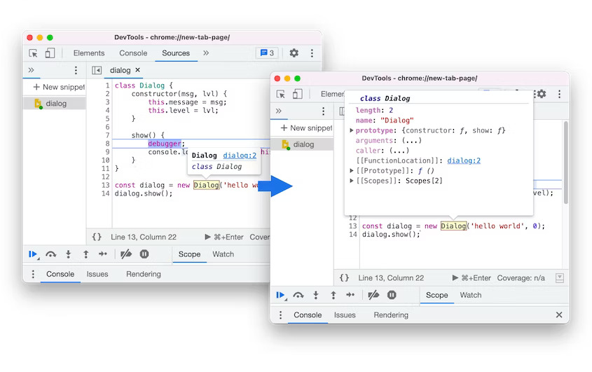
DevTools: Preview class/function properties on hover
You can now hover over a class or function in the Sources panel during debugging to preview its properties. Previously, it only showed the function name and a link to its location in the source code.
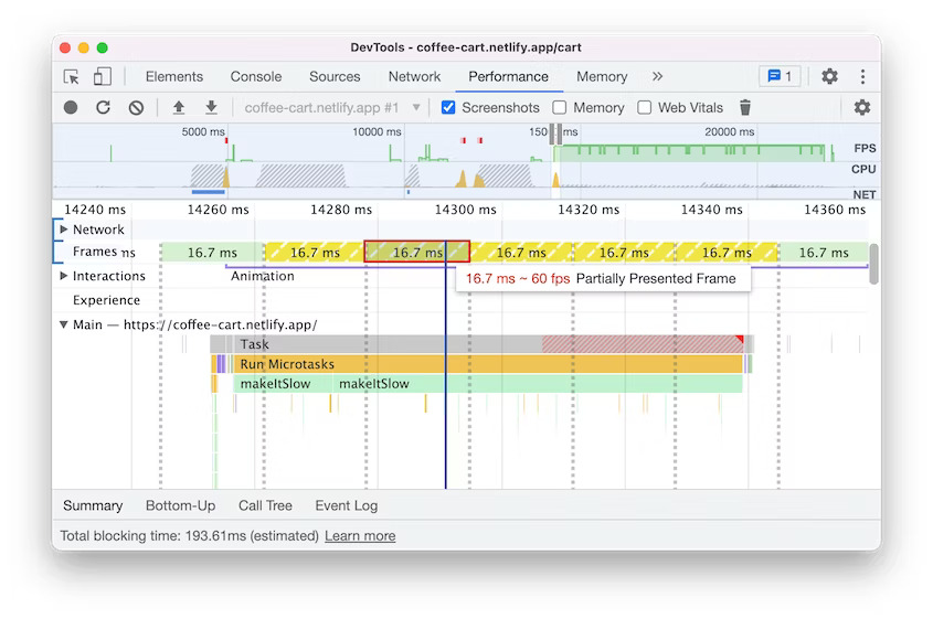
DevTools: Partially presented frames in the Performance panel
Performance recording now displays a new frame category "Partially presented frames" in the Frames timeline. Previously, the Frames timeline visualizes any frames with delayed main-thread work as "dropped frames". However, there are cases where some frames may still produce visual updates (e.g. scrolling) driven by the compositor thread. This leads to user confusion because the screenshots of these “Dropped frames” are still reflecting visual updates.
The new "Partially presented frames" aims to indicate more intuitively that although some content is not presented timely in the frame, the issue is not so severe as to block visual updates altogether.
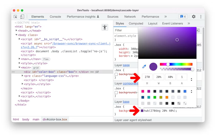
DevTools: Support for the hwb() color function
You can now view and edit HWB color format in Blisk DevTools. In the Styles pane, hold the Shift key and click on any color preview to change the color format. The HWB color format is added. Alternatively, you can change the color format to HWB in the color picker.
The new "Partially presented frames" aims to indicate more intuitively that although some content is not presented timely in the frame, the issue is not so severe as to block visual updates altogether.
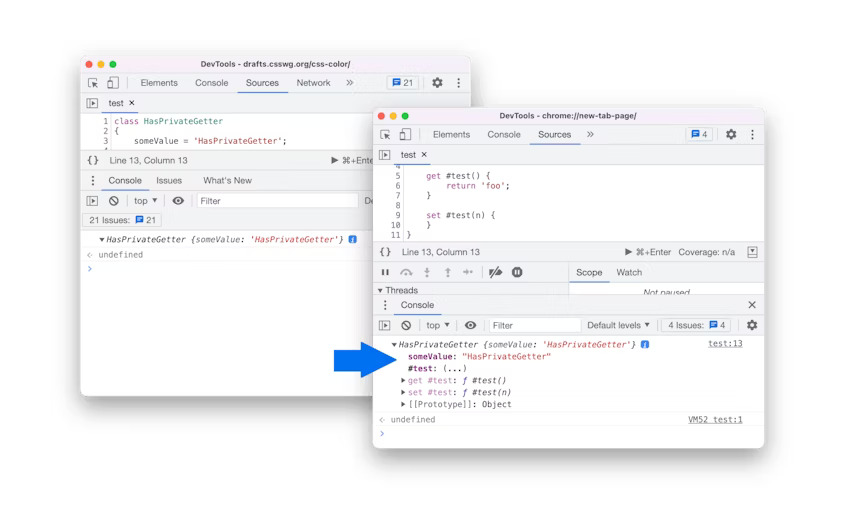
DevTools: Improved private properties
DevTools now properly evaluates and displays private accessors. Previously, you couldn't expand classes with private accessors in the Console and the Sources panel.
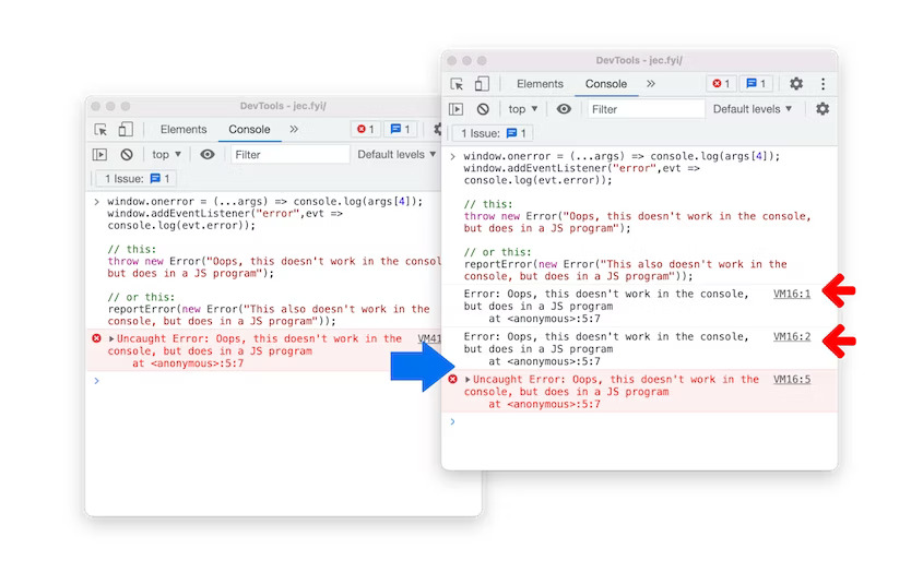
DevTools: Handle script execution errors in the Console
Errors during script evaluation in the Console now generate proper error events that trigger the window.onerror handler and are dispatched as "error" events on the window object.
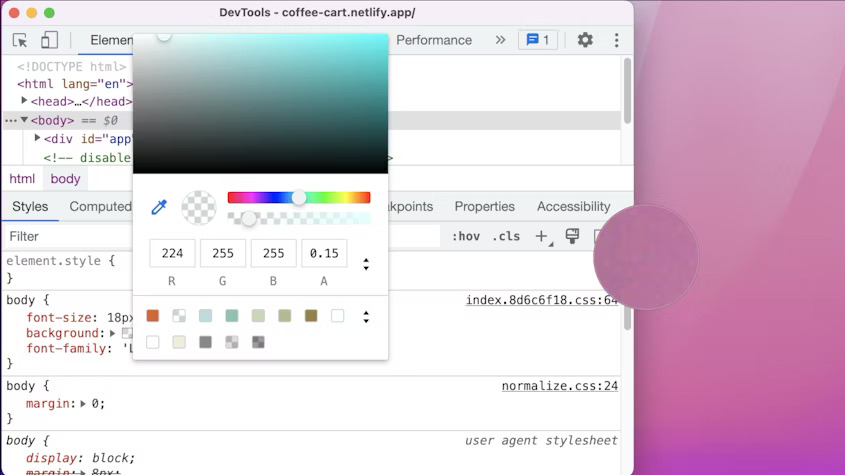
DevTools: Picking a color outside of the browser
DevTools now supports picking a color outside of the browser. Previously, you could only pick a color within the browser. In the Styles pane, click on any color preview to open a color picker. Use the eyedropper to pick a color from anywhere.
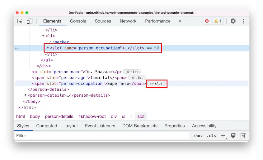
DevTools: Reveal assigned slot of an element
Slotted elements in the Elements panel have a new slot badge. When debugging layout issues, use this feature to identify the element which affects the node's layout quicker. Learn how to use and elements to create a flexible template that can then be used to populate the shadow DOM of a web component at MDN web docs.
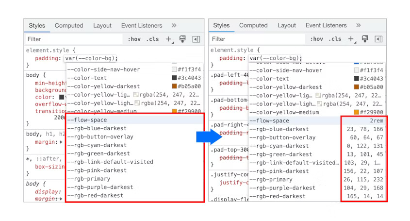
DevTools: CSS variables improvements
When autocompleting CSS variables, DevTools now populates the non-color variable with a meaningful value so that you can preview what kind of change the value will have on the node.
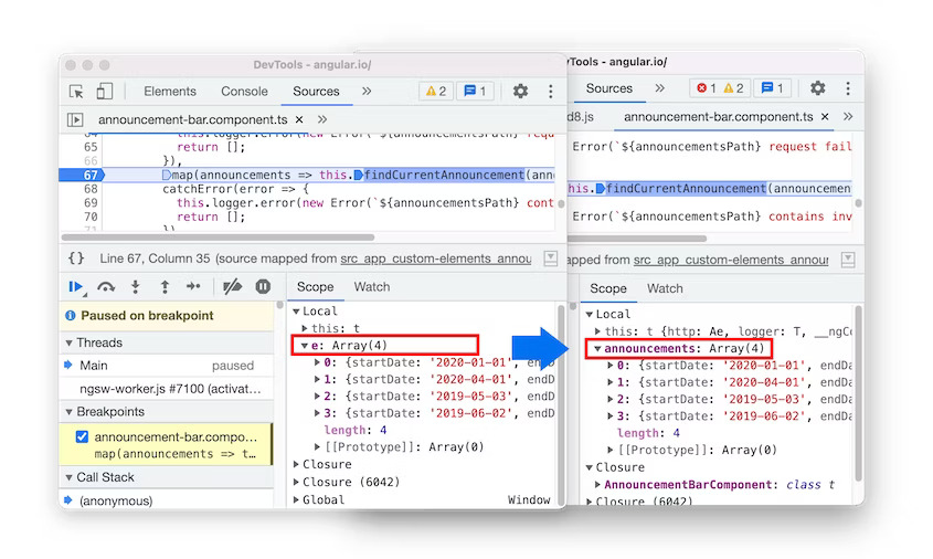
DevTools: Source maps improvements
Here are a few fixes on source maps to improve the overall debugging experience:
-
Breakpoints now work in inline
<script>with sourceURL annotations.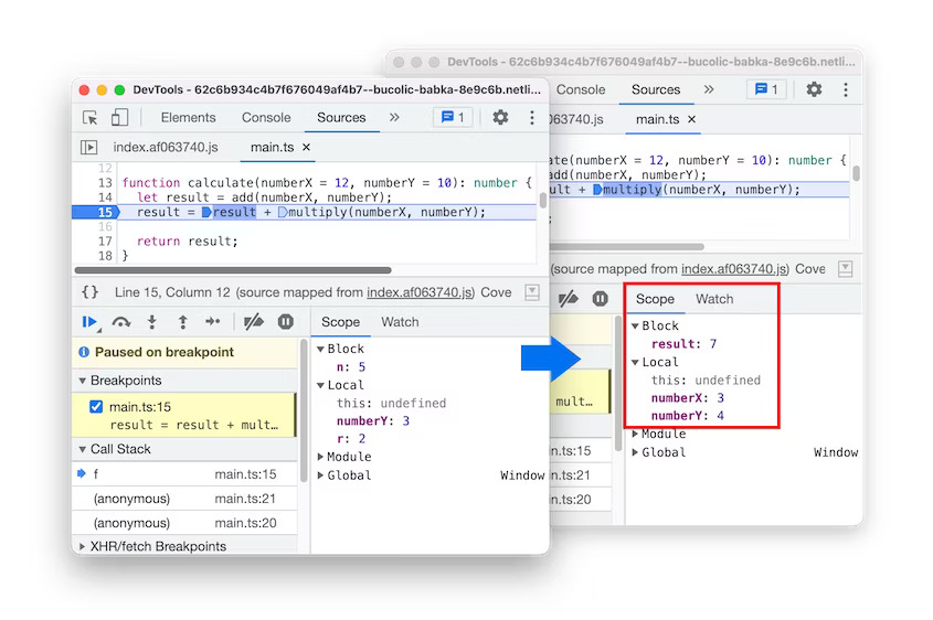
-
The debugger now resolves block-scoped variables in the Scope view with source maps.
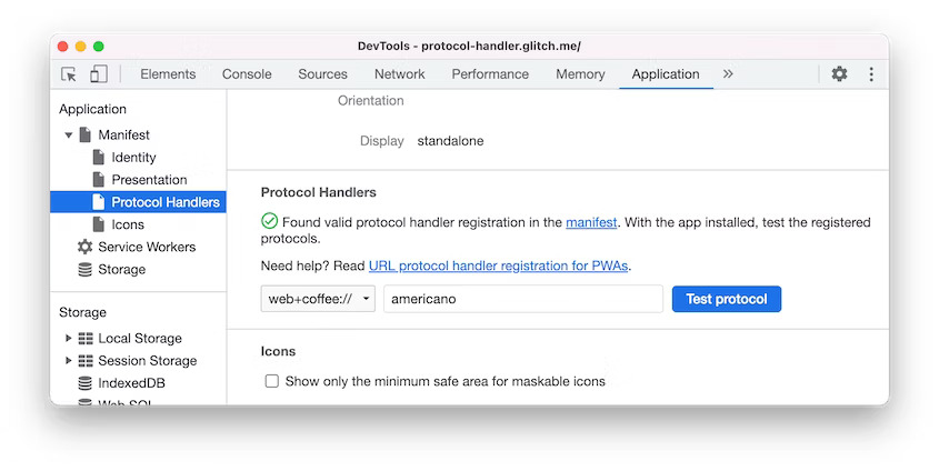
DevTools: Protocol handlers in the Manifest pane
You can now use DevTools to test the URL protocol handler registration for Progressive Web Apps (PWA). The URL protocol handler registration lets installed PWAs handle links that use a specific protocol (e.g. magnet, web+example) for a more integrated experience.
Navigate to the Protocol Handlers section via the Application > Manifest pane. You can view and test all the available protocols here.
Learn more about Developer Mode, Development Domain, and Device Manager on Blisk Documentation.
